


এলিমেন্ট প্যানেলে ব্যাজের এই বিস্তারিত রেফারেন্সের সাহায্যে বিভিন্ন ওভারলে টগল করুন এবং DOM ট্রি নেভিগেশন দ্রুত করুন।
ব্যাজ দেখান বা লুকান
নির্দিষ্ট কিছু ব্যাজ দেখাতে বা লুকাতে:
- DevTools খুলুন।
- DOM ট্রিতে কোনও এলিমেন্টে ডানদিকের বোতামে ক্লিক করুন এবং ব্যাজ সেটিংস সাব-মেনুতে এক বা একাধিক ব্যাজ চেক করুন।
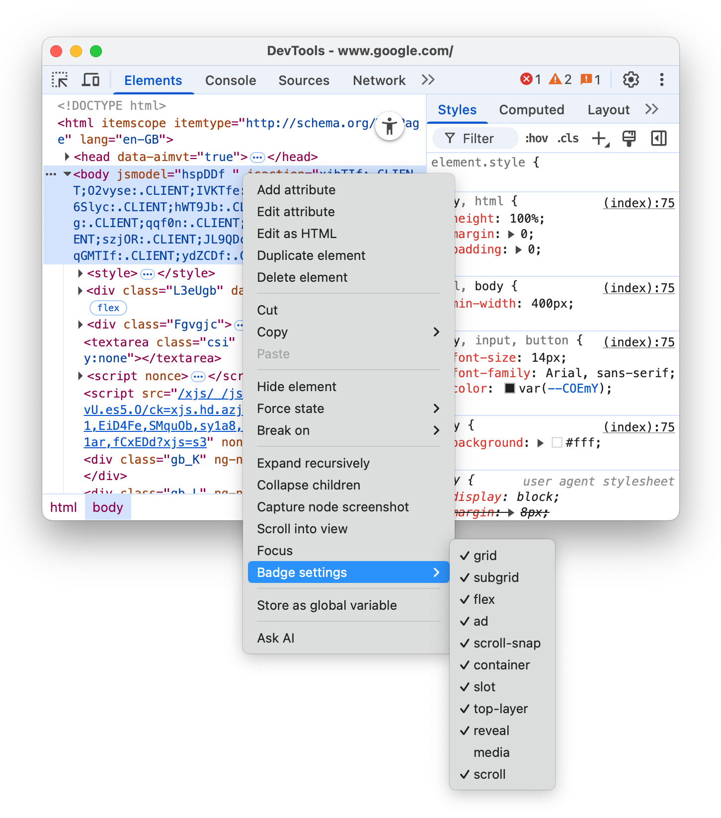
এলিমেন্ট প্যানেল, DOM ট্রি-তে উপযুক্ত এলিমেন্টের পাশে বেছে নেওয়া ব্যাজ দেখায়। পরবর্তী বিভাগে প্রতিটি ব্যাজ সম্পর্কে ব্যাখ্যা করা হয়েছে।
সোর্স-দেখুন
HTML পৃষ্ঠার মূল অংশে <html> ট্যাগের ঠিক পাশে view-source ব্যাজটি থাকে। সোর্স প্যানেলে আপনার পৃষ্ঠার সোর্স দেখতে এটিতে ক্লিক করুন।
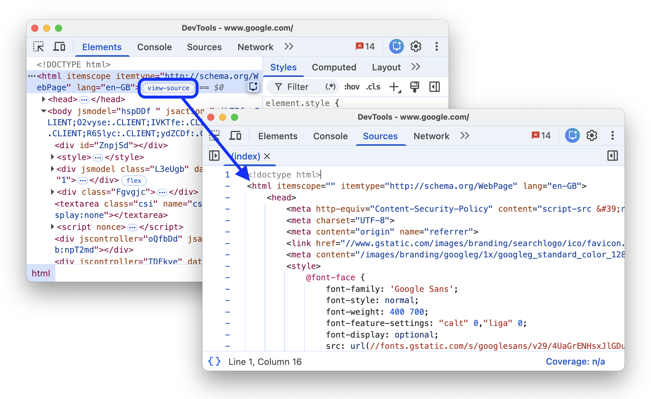
এই ব্যাজ Chrome-এর পৃষ্ঠা প্রসঙ্গ (রাইট-ক্লিক) মেনুতে পৃষ্ঠার সোর্স দেখুন বিকল্পের একটি বিকল্প ওয়ার্কফ্লো প্রদান করে:
- Chrome-এ, কোনও পৃষ্ঠায় মাউসে ডানদিকের বোতামে ক্লিক করে > পরীক্ষা করুন।
- এলিমেন্ট প্যানেলে,
<html>ট্যাগের পাশে থাকাview-sourceব্যাজে ক্লিক করুন। - সোর্স প্যানেলে পৃষ্ঠার সোর্স পরীক্ষা করুন।
গ্রিড
কোনও HTML এলিমেন্টের display CSS প্রপার্টি grid বা inline-grid হিসেবে সেট করা থাকলে, সেটি গ্রিড কন্টেনার হয়। এই ধরনের এলিমেন্টের পাশে grid ব্যাজ থাকে যা সংশ্লিষ্ট ওভারলে টগল করে।
নিম্নলিখিত প্রিভিউতে ওভারলে টগল করুন:
- প্রিভিউতে এলিমেন্ট পরীক্ষা করুন।
- DOM ট্রি-তে, এলিমেন্টের পাশে থাকা
gridব্যাজে ক্লিক করুন এবং ওভারলেটি দেখুন।

ওভারলেতে কলাম, সারি, তাদের সংখ্যা এবং ফাঁক দেখানো হয়।
গ্রিড লেআউট কীভাবে ডিবাগ করবেন তা জানতে, CSS গ্রিড পরীক্ষা করুন দেখুন।
সাবগ্রিড
সাবগ্রিড হল নেস্টেড গ্রিড যা প্যারেন্ট গ্রিডের মতো একই ট্র্যাক ব্যবহার করে। কোনও এলিমেন্টের grid-template-columns, grid-template-rows প্রপার্টির একটি বা দুটিই subgrid হিসেবে সেট করা থাকলে, সেটি সাবগ্রিড কন্টেনার হিসেবে বিবেচিত হয়। এই ধরনের এলিমেন্টের পাশে subgrid ব্যাজ থাকে যা সংশ্লিষ্ট ওভারলে টগল করে।
নিম্নলিখিত প্রিভিউতে ওভারলে টগল করুন:
- প্রিভিউতে এলিমেন্টটি পরীক্ষা করুন।
- DOM ট্রিতে, এলিমেন্টের পাশে
subgridব্যাজে ক্লিক করুন এবং ওভারলে দেখুন।

ওভারলেতে সাবগ্রিডের কলাম, সারি, তাদের সংখ্যা এবং ফাঁক দেখানো হয়।
ফ্লেক্স
কোনও HTML এলিমেন্টের display CSS প্রপার্টি flex বা inline-flex হিসেবে সেট করা থাকলে, সেটি ফ্লেক্স কন্টেনার হয়। এই ধরনের এলিমেন্টের পাশে flex ব্যাজ থাকে যা সংশ্লিষ্ট ওভারলে টগল করে।
নিম্নলিখিত প্রিভিউতে ওভারলে টগল করুন:
- প্রিভিউতে এলিমেন্টটি পরীক্ষা করুন।
- DOM ট্রি-তে, এলিমেন্টের পাশে থাকা
flexব্যাজে ক্লিক করুন এবং ওভারলেটি দেখুন।

ওভারলে চাইল্ড এলিমেন্টের পজিশন দেখায়।
CSS ফ্লেক্সবক্স ডিবাগ ও পরীক্ষা করুন লিঙ্ক থেকে ফ্লেক্স লেআউট ডিবাগ করার পদ্ধতি সম্পর্কে জানুন।
বিজ্ঞাপন
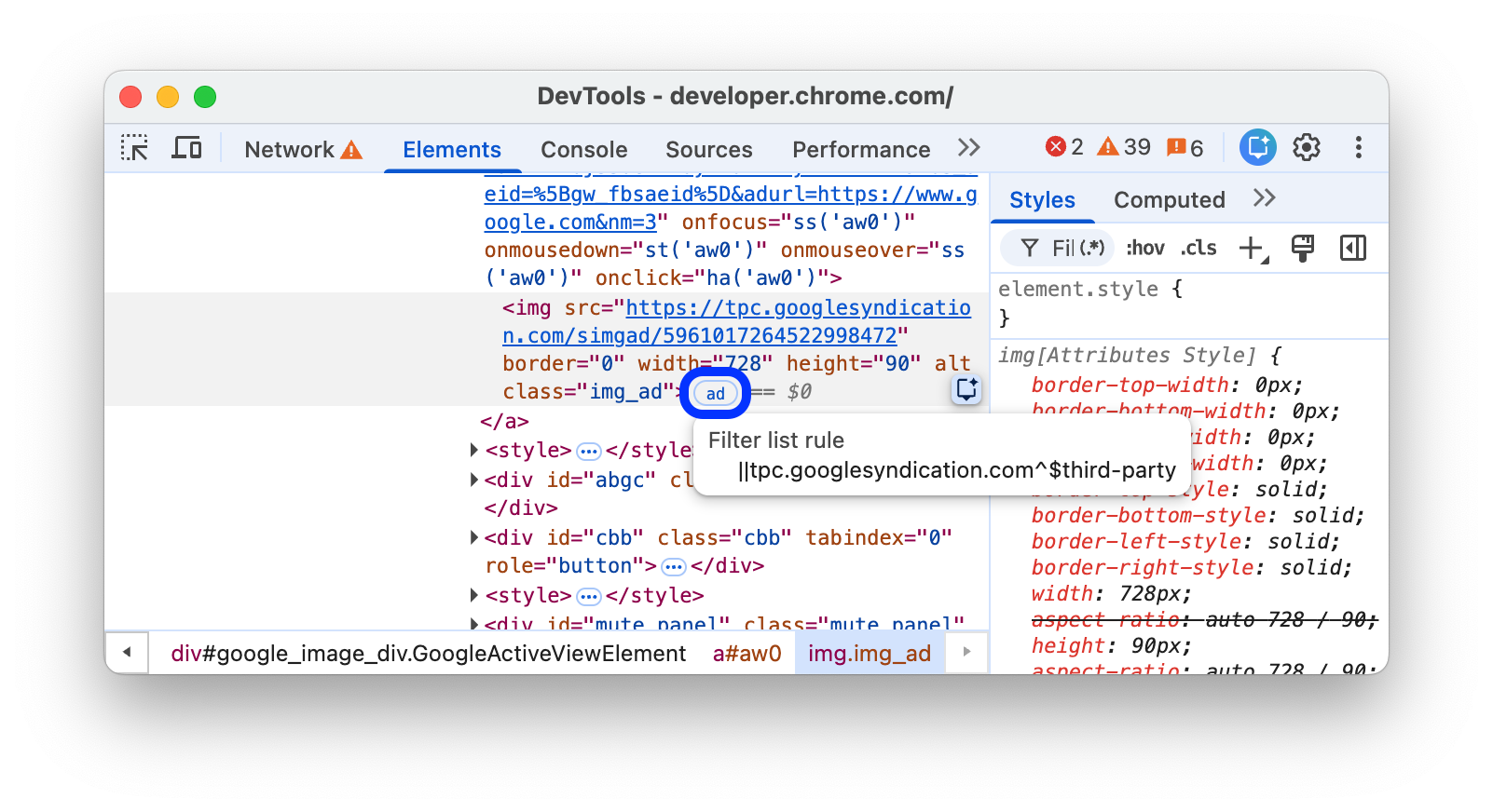
DevTools কিছু বিজ্ঞাপন ফ্রেম শনাক্ত করে সেগুলিকে ট্যাগ করতে পারে। এই ধরনের ফ্রেমের পাশে ad ব্যাজ থাকে।
নিচে দেওয়া প্রিভিউতে বিজ্ঞাপন দেখুন:
- প্রিভিউতে এলিমেন্টটি পরীক্ষা করুন।
- DOM ট্রি-তে,
adব্যাজ সহ কোনও এলিমেন্ট খুঁজুন।

ad ব্যাজে ক্লিক করা যায় না, তবে আপনি সেটির উপর মাউস নিয়ে গেলে, একটি টুলটিপ দেখতে পাবেন যা এলিমেন্টটিকে কেন বিজ্ঞাপন হিসেবে শনাক্ত করা হয়েছে সেই বিষয়ে প্রসঙ্গ প্রদান করে, যেমন:
- স্ক্রিপ্টের সম্পূর্ণ ইতিহাস: এলিমেন্ট তৈরি করার জন্য কোন কোন স্ক্রিপ্ট ব্যবহার করা হয়েছে।
- ফিল্টার তালিকা সংক্রান্ত নিয়ম: ফিল্টার তালিকা থেকে নির্দিষ্ট নিয়ম (যেমন,
EasyList) যা এলিমেন্ট বা সেটির লোড করা রিসোর্সের সাথে মিলে গেছে।
এছাড়াও, আপনি রেন্ডারিং ট্যাব ব্যবহার করে লাল রঙে বিজ্ঞাপন ফ্রেম হাইলাইট করতে পারবেন।
স্ক্রল করুন
কোনও HTML এলিমেন্টকে স্ক্রল কন্টেনার বলা হয় যদি সেটির overflow CSS প্রপার্টি scroll-এ সেট করা থাকে অথবা ওভারফ্লো হওয়ার মতো পর্যাপ্ত কন্টেন্ট থাকলে auto-এ সেট করা থাকে। এই ধরনের এলিমেন্টের পাশে scroll ব্যাজ থাকে।

স্ক্রল-স্ন্যাপ
স্ক্রল কন্টেনারে CSS প্রপার্টি থাকতে পারে যা স্ন্যাপ পয়েন্ট কনফিগার করে। এই ধরনের এলিমেন্টের পাশে scroll-snap ব্যাজ থাকে যা সংশ্লিষ্ট ওভারলে টগল করে।
নিম্নলিখিত প্রিভিউতে ওভারলে টগল করুন:
- প্রিভিউতে এলিমেন্টটি পরীক্ষা করুন।
- DOM ট্রিতে, এলিমেন্টের পাশে থাকা
scroll-snapব্যাজে ক্লিক করুন। - এলিমেন্টটি ডানদিকে স্ক্রল করে দেখুন এবং ওভারলে লক্ষ্য করুন।

ওভারলেতে এলিমেন্টের পজিশন ও স্ন্যাপ পয়েন্ট দেখানো হয়।
কন্টেনার
কোনও HTML এলিমেন্টে container-type CSS প্রপার্টি থাকলে সেটি কন্টেনার হয়। এই ধরনের এলিমেন্টের পাশে container ব্যাজ থাকে যা সংশ্লিষ্ট ওভারলে টগল করে।
নিম্নলিখিত প্রিভিউতে ওভারলে টগল করুন:
- প্রিভিউতে এলিমেন্ট পরীক্ষা করুন।
- DOM ট্রি-তে, এলিমেন্টের পাশে থাকা
containerব্যাজে ক্লিক করুন। - নিচের ডানদিকের কোণ টেনে এলিমেন্টের সাইজ পরিবর্তন করার চেষ্টা করুন এবং লেআউট পরিবর্তন ও ওভারলে লক্ষ্য করুন।

ওভারলেতে চাইল্ড এলিমেন্টের পজিশন দেখানো হয়।
কন্টেনার কোয়েরি কীভাবে ডিবাগ করতে হয় তা জানতে, CSS কন্টেনার কোয়েরি পরীক্ষা ও ডিবাগ করুন দেখুন।
স্লট
<slot> HTML এলিমেন্ট হল একটি প্লেসহোল্ডার যা আপনি নিজের কন্টেন্ট দিয়ে পূরণ করতে পারেন। <template> এলিমেন্টের সাথে <slot> আপনাকে আলাদা DOM ট্রি তৈরি করতে এবং সেগুলি একসাথে উপস্থাপন করতে দেয়। সংশ্লিষ্ট স্লটের লিঙ্ক হিসেবে কাজ করে এমন slot ব্যাজ স্লট কন্টেন্ট এলিমেন্টের পাশে থাকে।
নিচের প্রিভিউতে slot ব্যাজটি দেখুন:
- প্রিভিউতে এলিমেন্টটি পরীক্ষা করুন।
- DOM ট্রি-তে, সংশ্লিষ্ট স্লট লোকেট করতে, এলিমেন্টের পাশে থাকা
slotব্যাজে ক্লিক করুন।
revealব্যাজে ক্লিক করে স্লটের কন্টেন্টে ফিরে যান।
উপরের লেয়ার
এই ব্যাজ আপনাকে টপ লেয়ার-এর ধারণা বুঝতে এবং এটি ভিজ্যুয়ালাইজ করতে সাহায্য করে। z-index যাই হোক না কেন, সবচেয়ে উপরের লেয়ারটি অন্য সব লেয়ারের উপরে কন্টেন্ট রেন্ডার করে। আপনি .showModal() মেথড ব্যবহার করে কোনও <dialog> এলিমেন্ট খুললে, ব্রাউজার সেটি সবচেয়ে উপরের লেয়ারে রাখে।
টপ লেয়ার এলিমেন্ট ভিজ্যুয়ালাইজ করতে সাহায্য করার জন্য, এলিমেন্ট প্যানেল ক্লোজিং </html> ট্যাগের পরে DOM ট্রি-তে একটি #top-layer কন্টেনার যোগ করে।
সবচেয়ে উপরের লেয়ারের এলিমেন্টের পাশে top-layer (N) ব্যাজ থাকে, যেখানে N হল এলিমেন্টের ইন্ডেক্স নম্বর। ব্যাজগুলি #top-layer কন্টেনারের সংশ্লিষ্ট এলিমেন্টের লিঙ্ক।
নিচের প্রিভিউতে top-layer (N) ব্যাজটি দেখুন:
- প্রিভিউতে, ডায়ালগ খুলুন বিকল্পে ক্লিক করুন।
- ডায়ালগটি ভাল করে দেখুন।
- DOM ট্রিতে,
<dialog>এলিমেন্টের পাশে থাকাtop-layer (1)ব্যাজে ক্লিক করুন। এলিমেন্ট প্যানেল আপনাকে</html>ট্যাগ বন্ধ করার পরে#top-layerকন্টেনারের সংশ্লিষ্ট এলিমেন্টে নিয়ে যায়।
- এলিমেন্টের পাশে থাকা
revealব্যাজে ক্লিক করে অথবা এর::backdrop-এ ক্লিক করে<dialog>এলিমেন্টে ফিরে যান।
মিডিয়া
media ব্যাজ ডিফল্ট হিসেবে বন্ধ করা থাকে। চালু করা থাকলে, এটি <audio> এবং <video> এলিমেন্টের পাশে দেখা যায়। মিডিয়া প্যানেল খুলতে এবং আপনার মিডিয়া ডিবাগ করতে এই ব্যাজে ক্লিক করুন।

আরও তথ্যের জন্য, মিডিয়া প্যানেলের মাধ্যমে মিডিয়া প্লেয়ার ডিবাগ করা দেখুন।
পপওভার
পপওভার হল popover অ্যাট্রিবিউট সহ যেকোনও এলিমেন্ট এবং এটি টুলটিপ, অ্যালার্ট, টোস্ট ও আরও অনেক কিছু সহ ইন্টার্যাক্টিভ প্যাটার্নের বিস্তৃত রেঞ্জের জন্য উপযোগী। এই ধরনের এলিমেন্টের পাশে popover ব্যাজ থাকে।
এই ব্যাজটি এর ঠিক পাশে থাকা top-layer ব্যাজ টগল করে যা #top-layer কন্টেনারের সংশ্লিষ্ট এলিমেন্টের সাথে লিঙ্ক করে।
নিচের প্রিভিউতে popover ব্যাজটি খুঁজে দেখুন:
- প্রিভিউতে, পপওভার টগল করুন বিকল্পে ক্লিক করুন।
- যে পপওভার দেখা যাবে সেটি ভাল করে দেখুন।
DOM ট্রি-তে,
<div popover>এলিমেন্টের পাশে থাকাpopoverব্যাজে ক্লিক করুন। এলিমেন্ট প্যানেলেtop-layerব্যাজ দেখতে পাবেন।
`সবচেয়ে উপরের লেয়ার বিভাগে দেওয়া ধাপগুলি অনুসরণ করুন।
আরও জানতে, https://web.dev/learn/css/popover-and-dialog দেখুন।
Starting-style
@starting-style নিয়ম কোনও এলিমেন্ট পৃষ্ঠায় রেন্ডার করার আগে সেটির প্রাথমিক স্টাইল নির্ধারণ করে। display: none থেকে অ্যানিমেট ইন করে এমন এলিমেন্টের জন্য এটি প্রয়োজন, কারণ অ্যানিমেট ইন করার জন্য তাদের একটি স্টেট প্রয়োজন। এই ধরনের এলিমেন্টের পাশে starting-style ব্যাজ থাকে।
এই ব্যাজ @starting-style নিয়মে স্টাইল টগল করে, যাতে আপনি অ্যাকশনে অ্যানিমেশন দেখতে পারেন।
নিচের প্রিভিউতে starting-style ব্যাজটি খুঁজে দেখুন:
- প্রিভিউতে, পপওভার খুলুন বিকল্পে ক্লিক করুন।
- যে পপ-ওভার দেখা যাচ্ছে সেটি পরিদর্শন করুন।
DOM ট্রি-তে,
<div popover>এলিমেন্টের পাশে থাকাstarting-styleব্যাজ টগল করুন।
অ্যাকশনে থাকা অ্যানিমেশন এবং এলিমেন্ট > স্টাইল ট্যাবে প্রয়োগ করা স্টাইল লক্ষ্য করুন।
আরও জানতে, অ্যানিমেটিং পপওভার দেখুন।
কাস্টম-এলিমেন্ট
হাইফেনযুক্ত ট্যাগ নাম বা কাস্টমাইজ করা বিল্ট-ইন এলিমেন্টের জন্য is="..." অ্যাট্রিবিউট দ্বারা শনাক্ত করা কাস্টম HTML এলিমেন্ট-এর DOM ট্রিতে সেগুলির পাশে custom-element ব্যাজ থাকে।
সোর্স প্যানেলে প্রাসঙ্গিক কোডে যেতে ব্যাজে ক্লিক করুন।
