The Chrome Web Store works hard to help users discover and install quality items. Making sure yours is a "quality item" can help ensure its prominence in the store, potentially increasing your user base.
We focus on surfacing quality items to users across the entire user experience—this includes the store listing page. Build trust with users by making a strong first impression, with a compelling and accurate store listing page. A quality listing page clearly communicates what your item will offer, using the item description, images, and other listing metadata. You can build and maintain your store listing page using the developer dashboard.
Items in the store are ranked or featured in order to make it easier for users to find high quality content. Ranking is performed by a heuristic that takes into account ratings from users as well as usage statistics, such as the number of downloads vs. uninstalls over time.
Other factors include the following:
- The design is pleasant to the eye.
- The item provides a clear purpose and fills a real user need.
- The setup and onboarding flow are intuitive.
- The item is easy to use.
Text
There are two main text resources that you can use to make your listing compelling: The item summary and the item description. The following sections explain how to make best use of these text fields.
Item title
The title of your extension should accurately reflect the extension's core function. A good extension title should be:
- Clear and descriptive: Users should have a good idea of what the extension does just by reading the title.
- Concise: Shorter titles are easier to remember and stand out in the store.
- Unique: Avoid titles that are similar to existing extensions.
Keep it brief and memorable, while conveying the main function of your extension.
Stuff the title with keywords. Short, catchy names are more memorable to users.
Item summary
Your summary is used to give an overview of your item in a concise phrase (132 characters or less). This is the main description of your item users see from the homepage, category pages and in search results. Ensure the most important text is included in your summary to help users understand what they can expect from your item in a quick glance.
Highlight features of your item that resonate with your audience's main use cases.
Include generic descriptions like "best extension ever", superlatives like "greatest" and "fastest", or specifically reference similar or competing extensions.
Item description
Your item description is intended to give users a more in-depth overview of the main features and capabilities of your item. Item descriptions appear on the item listing page, underneath the screenshots. Make your descriptions concise, informative, and accurate, using more than just one sentence. Help users understand what specific features and capabilities they can unlock after installing the extension. The ideal format is an overview paragraph followed by a short list of main features. Let users know why they'll love it. Avoid typos and symbols that commonly distract the user.
Focus on the keywords that represent the most important features of your extension.
Add unnecessary keywords to your description in an attempt to improve search results. Repetitive or irrelevant use of keywords can create an unpleasant user experience and result in an item being suspended from the Chrome Web Store. See [Keyword Spam policy][keyword-spam] for more information.
Images
The graphical assets that appear in your listing are the store icon, screenshots, and your promotional images. The following sections provide guidance for how you can best use these assets to provide a high-quality, compelling store listing.
Store icon
Your item's icon is one of the first elements of your item that users see when they are on your store listing page. Use an icon that is simple and recognizable to your brand. Most often, this will simply be the brand or developer logo. Ensure your icon follows our extension icon best practices.
Keep it simple, and use colors and design elements that are consistent with the branding of your other assets.
Include screenshots or UI elements. These details can be very hard to see in small sizes.
See more examples of icons that follow the correct guidelines on the extension icon best practices page.
Screenshots
Use screenshots (or videos) to convey the capabilities, look and feel, and experience of your item to users. You must provide at least one—and preferably the maximum allowed five—screenshots of your item to be displayed in the store. Screenshots should demonstrate the actual user experience, focusing on the core features and content so users can anticipate what the extension's experience will be like. Screenshots should reflect the most up-to-date functionality corresponding to the latest version of the extension.
- Do not include screenshots that are blurry, distorted, or pixelated in a way that is not an intentional aspect of your brand or user experience.
- Rotate screenshots appropriately. Do not upload images upside down, sideways, or otherwise skewed.
- Branding on screenshots and videos should be consistent with other branding elements on the store listing page (such as icon or promotional images), so users can immediately associate them with your extension and brand.
- Include visual aids like infographics, images and videos to explain the onboarding flow, user experience, and main functionalities of the item.
- Images should not use too much text to avoid overwhelming the user.
- Use square corners and no padding (full bleed).
- 1280x800 or 640x400 pixels.
Make sure your screenshots are clear and sized correctly. Use visual aids in the screenshots to help
explain how it works.

Use screenshots that are distorted, are of low quality, or have overwhelming amounts of text.

Promotional images: promo tiles and marquee image
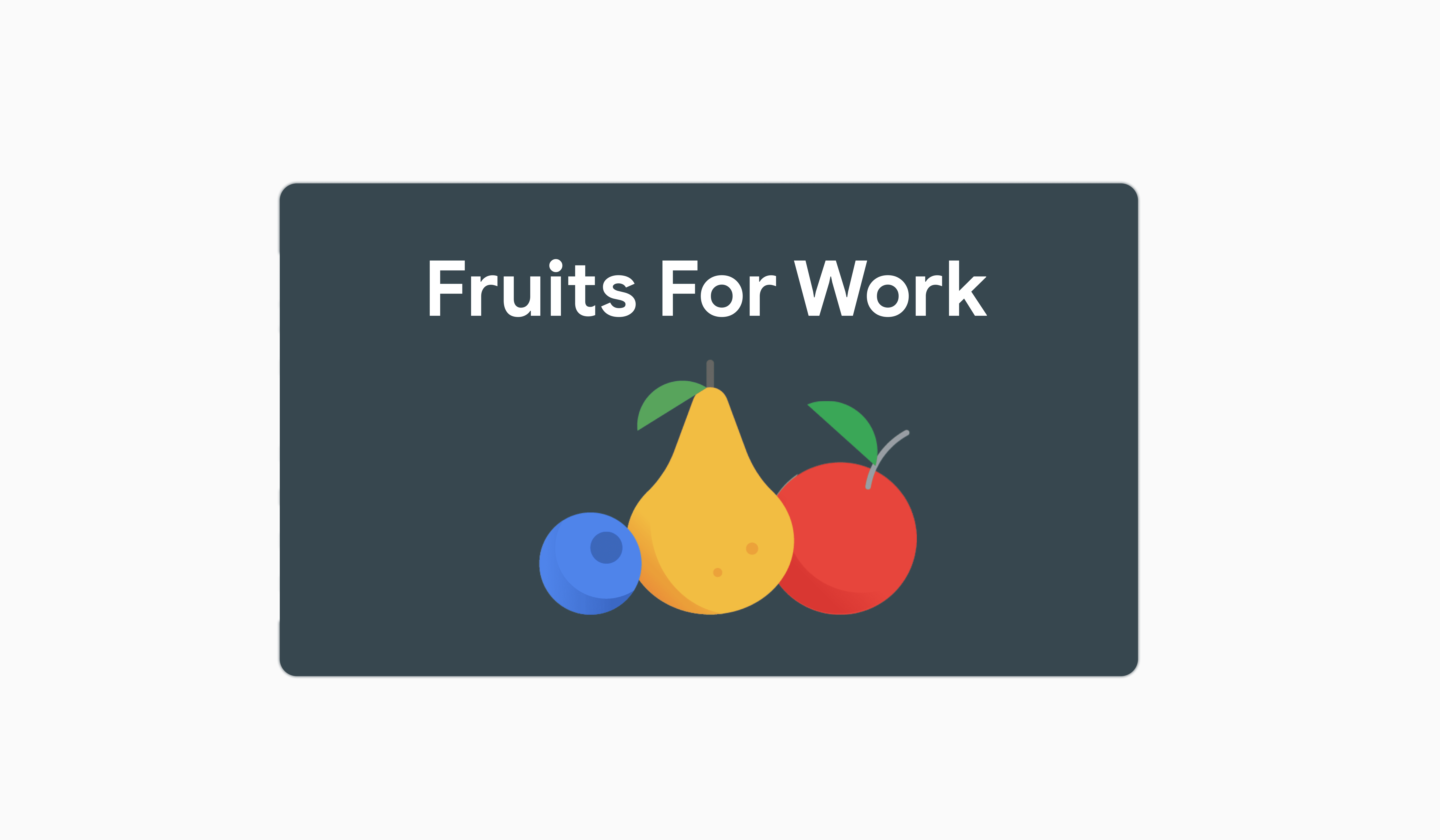
Promotional images are your chance to capture users' attention and entice them to learn more. Don't just use a screenshot; your images should communicate the brand and appear professional. Here are specifics about each promotional image:
- Small promo tile: 440x280 pixels
- Appears on the homepage, category pages, and in search results.
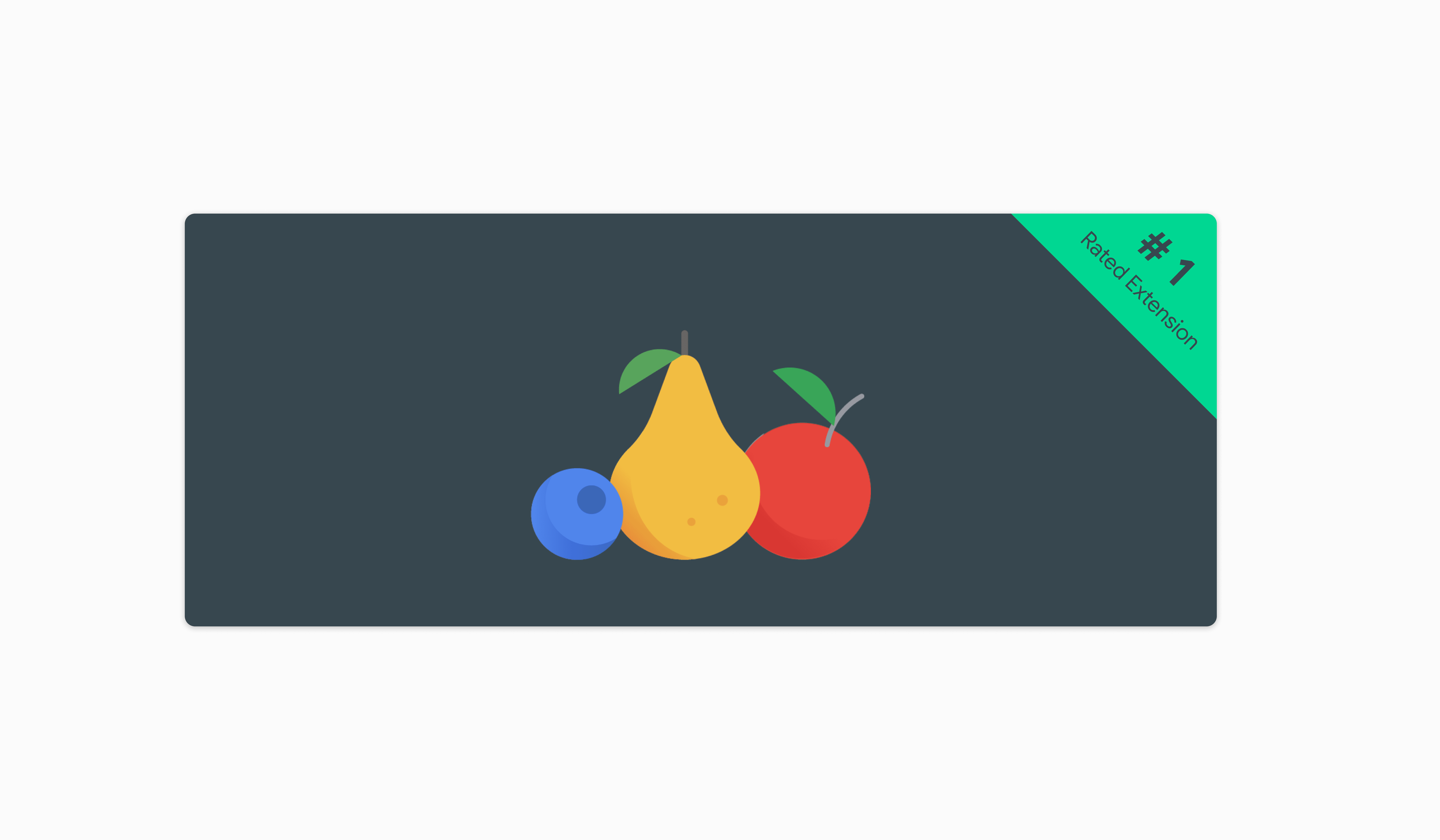
- Marquee image: 1400x560 pixels
- Used if your item is chosen for the marquee feature (the rotating carousel on the top of the Chrome Web Store homepage). To increase your chances of being featured, ensure your marquee image is uncluttered, high-resolution, and has consistent branding elements to your other assets so users can immediately associate it with your extension and brand.
Here are some rules of thumb for designing your promotional images:
- Avoid too much text.
- Avoid an image that is too "busy".
- Make sure your image works even when shrunk to half size.
- Use saturated colors if possible; they tend to work well.
- Avoid using a lot of white and light gray.
- Fill the entire region.
- Make sure the edges are well defined.
- Avoid claims that misrepresent the extension's or developer's current status or performance on the Chrome Web Store (such as "Editor's Choice" or "Number One").
- Branding on promotional images should be consistent with other branding elements on the store listing page (such as icon or screenshots).
Keep the image simple and clean, using colors and branding that matches your other assets.

Include claims that misrepresent your extension's status.

Additional fields
Including a website for your item and URLs for support pages can help build trust with users. Ensure these fields are filled out in the developer dashboard so users know where they can find more information about your item.
