The CSS Anchor Positioning API lets you position elements relative to other elements, known as anchors. This API simplifies complex layout requirements for many interface features like menus and submenus, tooltips, selects, labels, cards, settings dialogs, and many more. With anchor positioning built into the browser, you can build layered user interfaces without relying on third-party libraries, opening a world of creative possibilities.
Core Concepts: Anchors and positioned elements
At the heart of this API lies the relationship between anchors and positioned elements. An anchor is an element designated as a reference point using the anchor-name property. A positioned element is an element placed relative to an anchor using the position-anchor property or explicitly using anchor-name in its positioning logic.
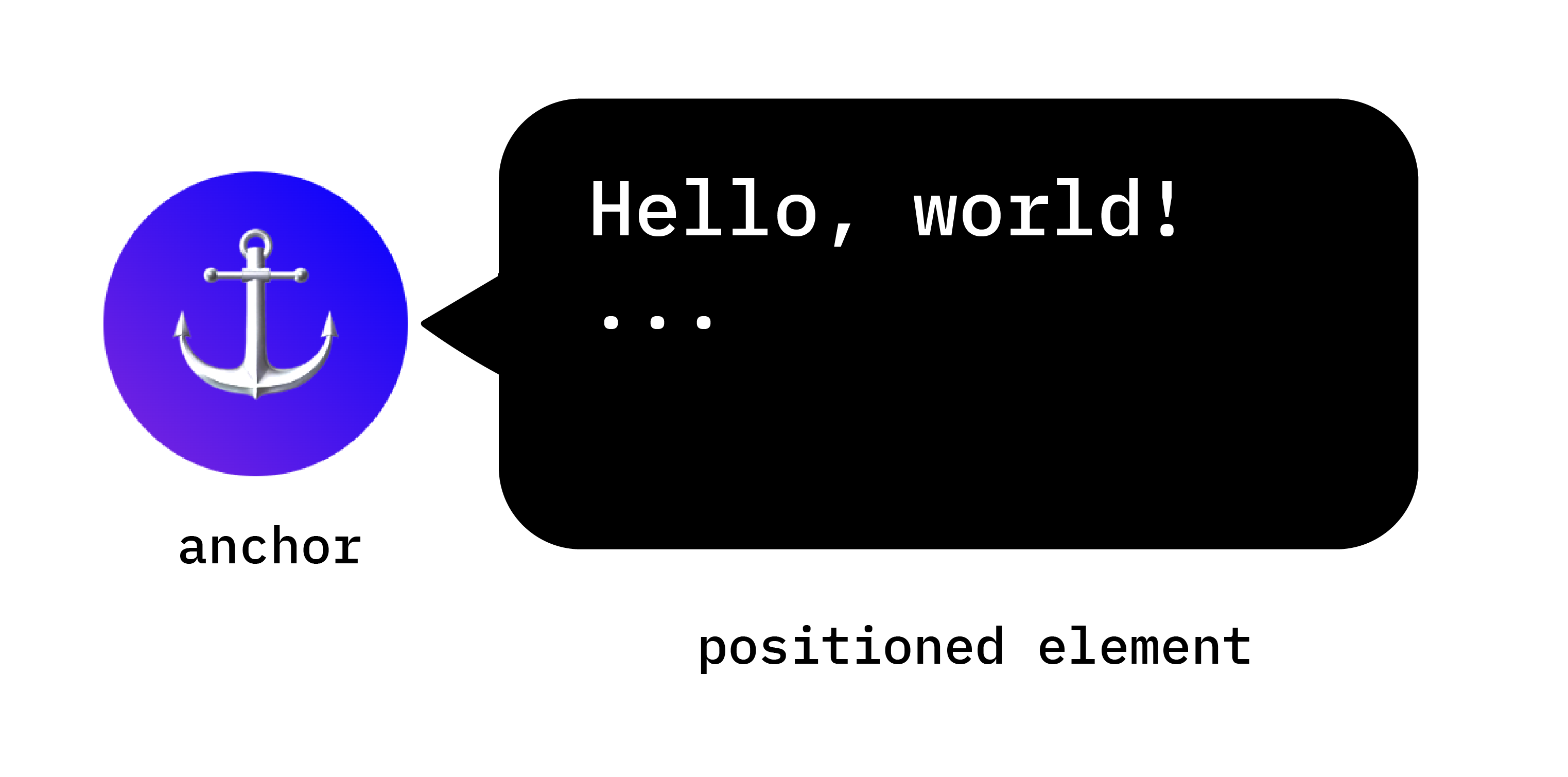
Set up anchors
Creating an anchor is straightforward. Apply the anchor-name property to the selected element, and assign it a unique identifier. This unique identifier must be prepended with a double dash, much like a CSS variable.
.anchor-button {
    anchor-name: --anchor-el;
}
Once assigned an anchor-name, .anchor-button serves as an anchor, ready to guide the placement of other elements. You can connect this anchor to other elements in one of two ways:
Implicit anchors
The first way to connect an anchor to another element is with an implicit anchor as in the following code example. The position-anchor property is added to the element you want to connect to your anchor, and has the name of the anchor (in this case --anchor-el) as a value.
.positioned-notice {
    position-anchor: --anchor-el;
}
With an implicit anchor relationship, you can position elements using the anchor() function without explicitly specifying the anchor name at its first argument.
.positioned-notice {
    position-anchor: --anchor-el;
    top: anchor(bottom);
}
Explicit anchors
Alternatively, you can use the anchor name directly in the anchor function (for example, top: anchor(--anchor-el bottom). This is called an explicit anchor, and can be handy if you want to anchor to multiple elements (read on for an example).
.positioned-notice {
    top: anchor(--anchor-el bottom);
}
Position elements relative to anchors
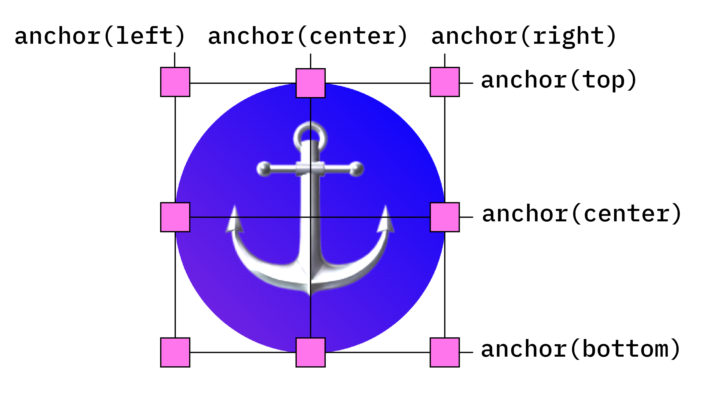
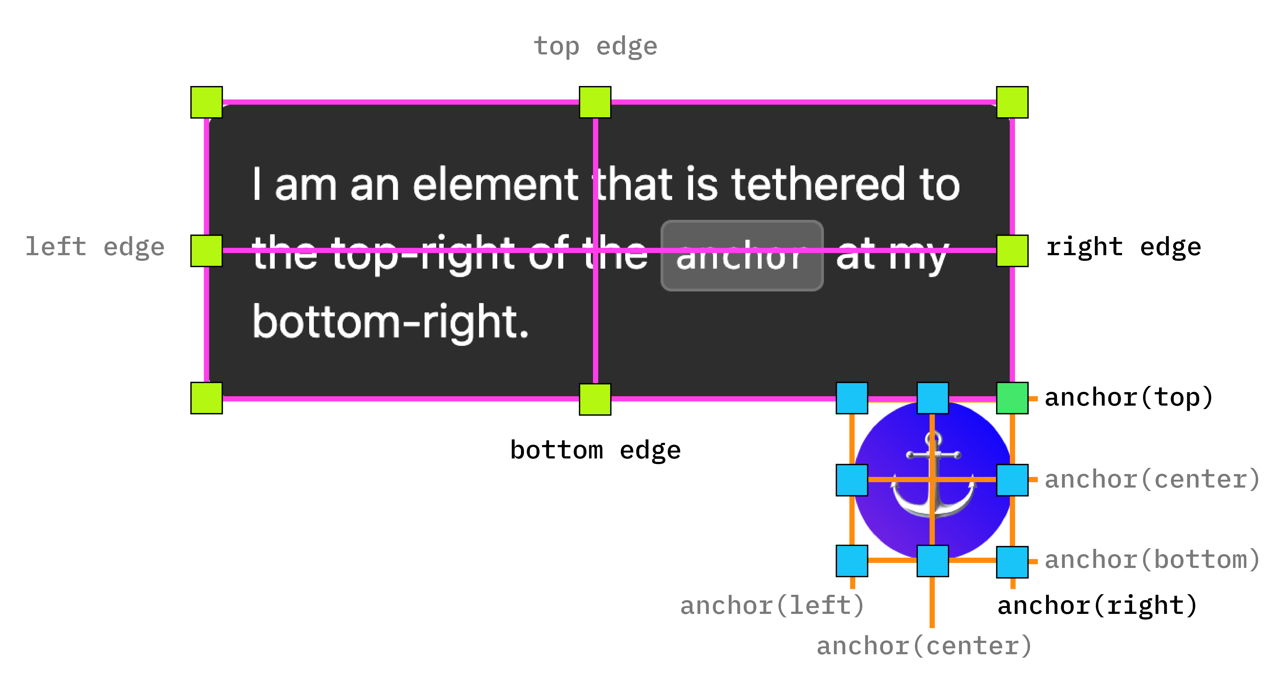
Anchor positioning builds on CSS absolute positioning To use positioning values you need to add position: absolute to your positioned element. Then, use the anchor() function to apply positioning values. For example, to position an anchored element at the top left of the anchoring element, use the following positioning:
.positioned-notice {
    position-anchor: --anchor-el;
    /* absolutely position the positioned element */
    position: absolute;
    /* position the right of the positioned element at the right edge of the anchor */
    right: anchor(right);
    /* position the bottom of the positioned element at the top edge of the anchor */
    bottom: anchor(top);
}
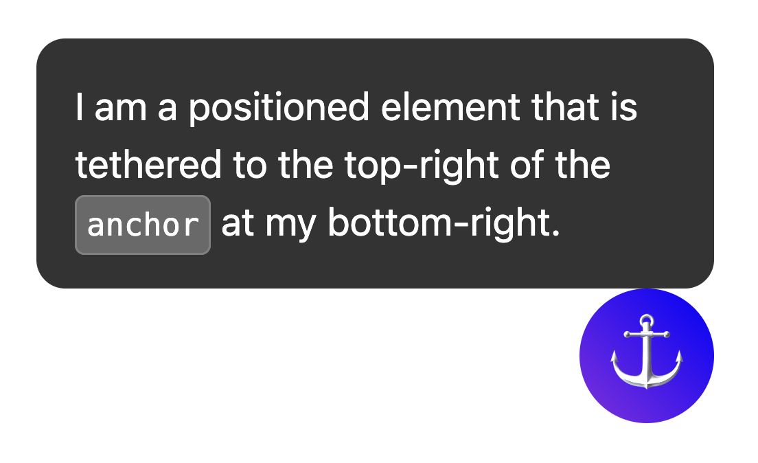
Now you have one element anchored to another, like so:
To use logical positioning for these values, the equivalents are as follows:
top=inset-block-startleft=inset-inline-startbottom=inset-block-endright=inset-inline-end
Center a positioned element with anchor-center
To make it easier to center your anchor positioned element relative to its anchor, there's a new value called anchor-center which can be used with the justify-self, align-self, justify-items, and align-items properties.
This example modifies the previous one by using justify-self: anchor-center to center the positioned element on top of its anchor.
.positioned-notice {
  position: absolute;
  /*  Anchor reference  */
  position-anchor: --anchor-el;
  /*  Position bottom of positioned elem at top of anchor  */
  bottom: anchor(top);
  /*  Center justification to the anchor */
  justify-self: anchor-center;
}
justify-center.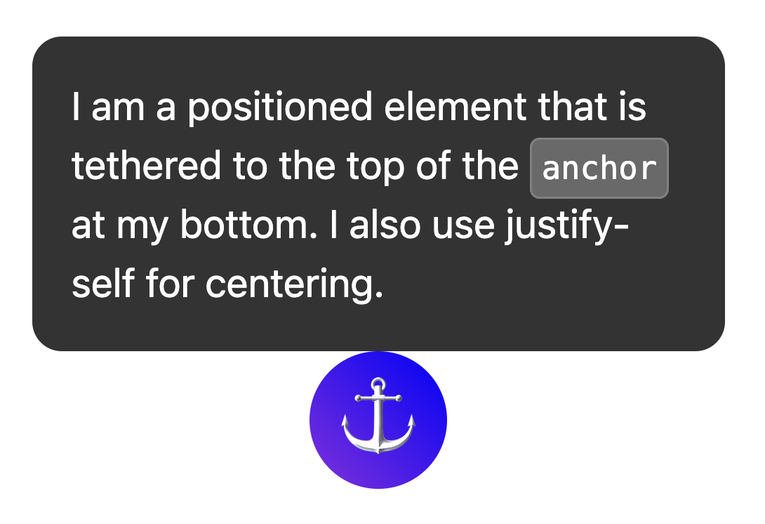
Multiple anchors
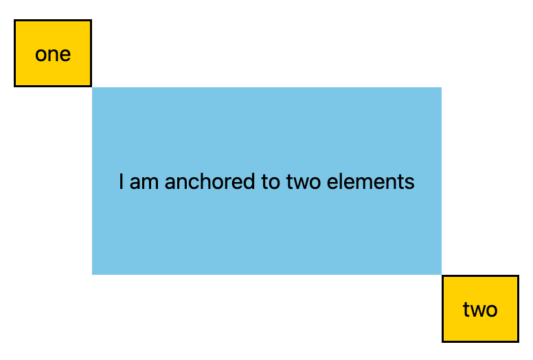
Elements can be tethered to more than one anchor. This means you may need to set position values that are positioned relative to more than one anchor. Do this by using the anchor() function and explicitly stating which anchor you are referencing in the first argument. In the following example, the top-left of a positioned element is anchored to the bottom-right of one anchor, and the bottom-right of the positioned element is anchored to the top-left of the second anchor:
.anchored {
  position: absolute;
  top: anchor(--one bottom);
  left: anchor(--one right);
  right: anchor(--two left);
  bottom: anchor(--two top);
}
Position with position-area
The anchoring API includes a new layout mechanism using the position-area property.
This property lets you place anchor positioned elements relative to their respective anchors, and works on a 9-cell grid with the anchoring element in the center.
To use position-area rather than absolute positioning, use the position-area property, with physical or logical values. For example:
- Top-center:
position-area: toporposition-area: block-start - Left-center:
position-area: leftorposition-area: inline-start - Bottom-center:
position-area: bottomorposition-area: block-end - Right-center:
position-area: rightorposition-area: inline-end
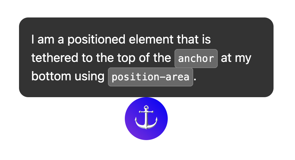
To explore these positions further, check out the following tool:
Size elements with anchor-size()
The anchor-size() function, also part of the anchor positioning API, can be used to size or position an anchor positioned element based on the size of its anchor (width, height, or inline and block sizes).
The following CSS shows an example of using this for height,using anchor-size(height) within a calc() function to set the maximum height of the tooltip to be two times the height of the anchor.
.positioned-notice {
  position-anchor: --question-mark;

  /*  set max height of the tooltip to 2x height of the anchor  */
  max-height: calc(anchor-size(height) * 2);
}
anchor-size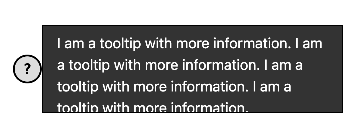
Use anchor with top-layer elements like popover and dialog
Anchor positioning works incredibly well with top-layer elements like popover. and <dialog>. While these elements are placed in a separate layer from the rest of the DOM subtree, anchor positioning lets you tether them back to, and scroll along with elements not in the top layer. This is a huge win for layered interfaces.
In the following example, a set of tooltip popovers are triggered open using a button. The button is the anchor and the tooltip is the positioned element. You can style the positioned element just like any other anchored element. For this specific example, the anchor-name and position-anchor are inline styles on the button and tooltip. Because each anchor needs a unique anchor name, when generating dynamic content, inlining is the easiest way to do this.
popover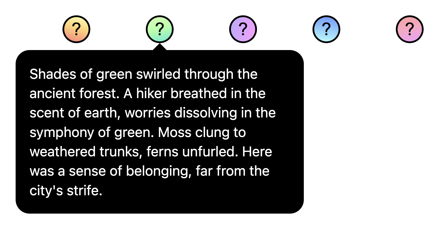
Adjust anchor positions with @position-try
Once you have your initial anchor position, you may want to adjust the position if the anchor reaches the edges of its containing block. To create alternative anchor positions, you can use the @position-try directive along with the position-try-fallbacks property.
In the following example, a submenu appears to the right of a menu. Menus and submenus are a great use of the anchor positioning API along with the popover attribute, as these menus tend to be anchored to a trigger button.
For this submenu, if there's not enough space horizontally, you can move it underneath the menu instead. To do this, first set up the initial position:
#submenu {
  position: absolute;
  position-anchor: --submenu;

  /* initial position */
  margin-left: var(--padding);
  position-area: right span-bottom;
}
Then, set up your fallback anchored positions using @position-try:
/* alternate position */
@position-try --bottom {
  margin: var(--padding) 0 0 var(--padding);
  posotion-area: bottom;
}
Finally, connect the two with position-try-fallbacks. All together, it looks like this:
#submenu {
  position: absolute;
  position-anchor: --submenu;
  /* initial position */
  margin-left: var(--padding);
  position-area: right span-bottom;
  */ connect with position-try-fallbacks */
  position-try-fallbacks: --bottom;
}

/* alternate position */
@position-try --bottom {
  margin: var(--padding) 0 0 var(--padding);
  position-area: bottom;
}
popoverAnchor position auto-flip keywords
If you have a basic adjustment, such as flipping from top to bottom or left to right (or both), you can even skip the step of creating custom @position-try declarations and use the built-in browser-supported flip keywords like flip-block and flip-inline. These work as stand-ins for custom @position-try declarations, and can be used in combination with each other:
position-try-fallbacks: flip-block, flip-inline, flip-block flip-inline;
Flip keywords can significantly simplify your anchor code. With just a few lines, you can create a fully-functional anchor with alternative positions:
#my-tooltip {
  position-anchor: --question-mark;
  position-area: top;
  position-try-fallbacks: flip-block;
}
position-try-fallbacks: flip-blockposition-visibility for anchors in subscrollers
There are some cases in which you may want to anchor an element within a subscroller of the page. In these instances, you can control the visibility of the anchor using position-visibility. When does the anchor stay in view? When does it disappear? You have control over these options with this feature. You use position-visibility: anchors-visible when you want the positioned element to stay in view until the anchor is out of view:
#tooltip {
  position: fixed;
  position-anchor: --anchor-top-anchor;
  position-visibility: anchors-visible;
  bottom: anchor(top);
}
position-visibility: anchors-visible DemoAlternatively, you use position-visibility: no-overflow to prevent the anchor from overflowing its container.
#tooltip {
  position: absolute;
  position-anchor: --anchor-top-anchor;
  position-visibility: no-overflow;
  bottom: anchor(top);
}
position-visibility: no-overflow DemoFeature detection and polyfilling
Because browser support is limited at this time, you likely want to use this API with some precautions. First, you can check for support directly in CSS by using the @supports feature query. The way to do this is to wrap your anchor styles in the following:
@supports (anchor-name: --myanchor) {

  /* Anchor styles here */

}
Additionally, you can polyfill the anchor positioning feature with the CSS anchor positioning polyfill by Oddbird, which works from Firefox 54, Chrome 51, Edge 79, and Safari 10. This polyfill supports most of the basic anchor position features, though the current implementation is not complete and contains some outdated syntax. You can use the unpkg link or import it directly in a package manager.
A note on accessibility
While the anchor positioning API allows an element to be positioned relative to others, it doesn't inherently create any meaningful semantic relationship between them. If there actually is a semantic relationship between the anchor element and the positioned element (for example the positioned element is a sidebar comment about the anchor text), one way to do that is to use aria-details to point from the anchor element to the positioned element(s). Screen reader software is still learning how to deal with aria-details, but support is improving.
<div class="anchor" aria-details="sidebar-comment">Main content</div>
<div class="positioned" id="sidebar-comment">Sidebar content</div>
.anchor {
  anchor-name: --anchor;
}

.positioned {
  position: fixed;
  position-anchor: --anchor;
}
If you are using anchor positioning with the popover attribute or with a <dialog> element, the browser will handle the focus navigation corrections for proper accessibility, so you don't need to have your popovers or dialogs in DOM order. Read more on the note on accessibility in the spec.

