This document is part of the high-definition CSS color guide.
There are two main strategies for updating your web project color to support wide gamut displays:
Graceful degradation: Use the new color spaces and let the browser and operating system figure out which color to show based on display capabilities.
Progressive enhancement: Use
@supportsand@mediato assess the capabilities of the user's browser, and if conditions are met, provide wide gamut colors.
If a browser doesn't understand display-p3 color:
color: red;
color: color(display-p3 1 0 0);
If a browser does understand display-p3 color:
color: red;
color: color(display-p3 1 0 0);
There are advantages and disadvantages to each. Here's a quick list of pros and cons:
Graceful degradation
- Pros
- The simplest route.
- The browser gamut maps or clamps to sRGB if not a wide gamut display, therefore the responsibility is on the browser.
- Cons
- The browser may gamut clamp or gamut map to a color you don't love.
- The browser may not understand the color request and fail entirely. However this can be mitigated by specifying the color twice, letting the cascade fallback to the previous color it does understand.
Progressive enhancement
- Pros
- More control with managed color fidelity.
- An additive strategy that doesn't affect the current colors.
- Cons
- You need to manage two separate color syntaxes.
- You need to manage two separate color gamuts.
Check for gamut and color space support
The browser allows checking for support for wide gamut capabilities and color syntax support from CSS and JavaScript. The exact gamut of colors the user has is not made available, a generalized answer is provided so user privacy is maintained. The exact color space support is made available though, as it's not specific to capabilities of the user's hardware like gamut is.
Color gamut support queries
The following code examples check the visiting user's range of colors in their display.
Check from CSS
The least specific support inquiry is the
dynamic-range
media query:
@media (dynamic-range: high) {
  /* safe to use HD colors */
}
Approximate, or more, support can be inquired with the
color-gamut
media query:
@media (color-gamut: srgb) {
  /* safe to use srgb colors */
}

@media (color-gamut: p3) {
  /* safe to use p3 colors */
}

@media (color-gamut: rec2020) {
  /* safe to use rec2020 colors */
}
There are an additional two media queries for checking support:
Check from JavaScript
For JavaScript, the
window.matchMedia()
function can be called and passed a media query for evaluation.
const hasHighDynamicRange = window
.matchMedia('(dynamic-range: high)')
.matches;

console.log(hasHighDynamicRange); // true || false

const hasP3Color = window
.matchMedia('(color-gamut: p3)')
.matches;

console.log(hasP3Color); // true || false
The above pattern can be copied for the rest of the media queries.
Color space support queries
The following code examples check the visiting user's browser and its selection of color spaces to work with.
Check from CSS
Individual color space support can be inquired using an
@supports query:
@supports (background: rgb(0 0 0)) {
  /* rgb color space supported */
}


@supports (background: color(display-p3 0 0 0)) {
  /* display-p3 color space supported */
}


@supports (background: oklch(0 0 0)) {
  /* oklch color space supported */
}
Check from JavaScript
For JavaScript, the
CSS.supports()
function can be called and passed a property and value pair to see if the
browser understands.
CSS.supports('background: rgb(0 0 0)')
CSS.supports('background: color(display-p3 0 0 0)')
CSS.supports('background: oklch(0 0 0)')
Putting the hardware and parsing checks together
While waiting for each browser to implement these new color features, it's a good idea to check for both hardware capability and color parsing capability. This is often what I use when progressively enhancing colors to high definition:
:root {
  --neon-red: rgb(100% 0 0);
  --neon-blue: rgb(0 0 100%);
}

/* is the display HD? */
@media (dynamic-range: high) {

  /* does this browser understand display-p3? */
  @supports (color: color(display-p3 0 0 0)) {

    /* safe to use display-p3 colors */
    --neon-red: color(display-p3 1 0 0);
    --neon-blue: color(display-p3 0 0 1);
  }
}
Debug color with Chrome DevTools
Chrome DevTools is updated and equipped with new tools to help developers create, convert and debug HD color.
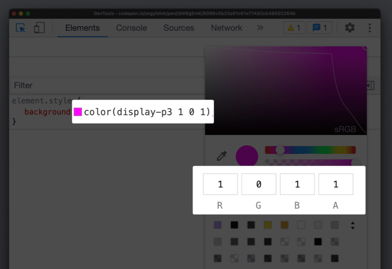
Updated color picker
The color picker now supports all the new color spaces. Allowing authors to interact with channel values just as they would have.

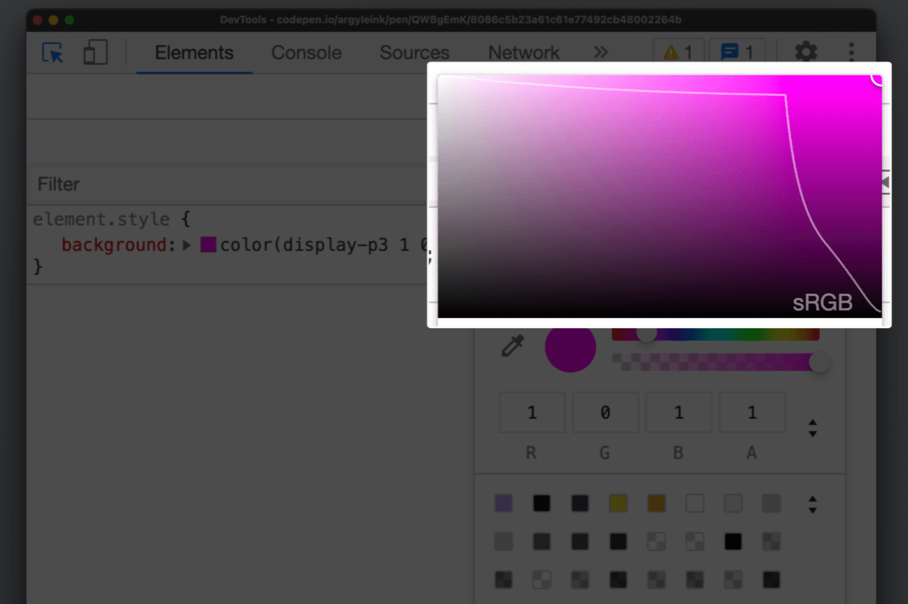
Gamut boundaries
A gamut boundary line has also been added, drawing a line between srgb and display-p3 gamuts. Making it clear which gamut the selected color is within.

This helps authors visually differentiate between HD colors and non-HD colors.
It's especially helpful when working with the color() function and the new
color spaces because they're capable of producing both non-HD and HD colors. If
you want to check which gamut your color is in, pop up the color picker and see!
Convert colors
DevTools has been able to convert colors between supported formats like hsl,
hwb, rgb and hex for many years. shift + click on a square color swatch in the
Styles pane to perform this conversion. The new color tools don't just cycle
through conversions, they yield a dialog where authors can see and pick the
conversion they want.
When converting, it's important to know if the conversion was clipped to fit the space. DevTools now have a warning icon to the converted color that alerts you to this clipping.

Discover more CSS debugging feature in DevTools.
Next steps
More vibrance, consistent manipulations and interpolations and overall deliver a more colorful experience to your users.
Read more color resources from the guide.

