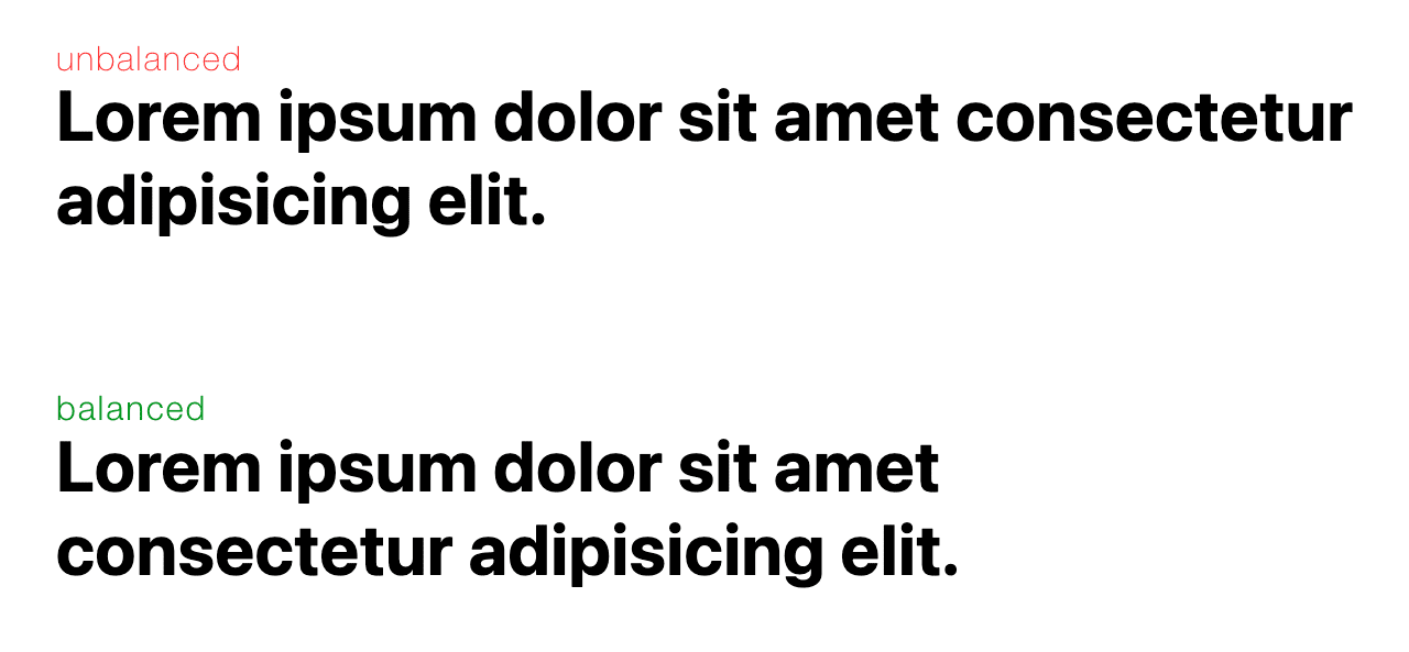
A classic typography technique of hand-authoring line breaks for balanced text blocks, comes to CSS.
The balance value for text-wrap is part of CSS Text Level 4. Take a look at the examples in this post to learn how
this one line of CSS can massively improve your text layouts.
Without text-wrap: balance; designers, content editors and publishers have
few tools
to change the way lines are balanced.. The best options available being to use
<wbr> or
­ to help
guide text layouts into smarter decisions about where to break lines and words.
As a developer, you don't know the final size, font size, or even language of a headline or paragraph. All the variables needed for an effective and aesthetic treatment of text wrapping, are in the browser. This is why we see headline wrapping as in the following image:

.unbalanced {
  max-inline-size: 50ch;
}
With text-wrap: balance from CSS Text 4, you can request the browser to
figure out the best balanced line wrapping solution for the text. The browser
does know all the factors, like font size, language, and allocated area.
Results of browser balanced text wrapping looks like this today:

.balanced {
  max-inline-size: 50ch;
  text-wrap: balance;
}
It's helpful to see them side by side, still, and without debug information overlaid.

Your eye should be much more pleased with the balanced text block. It grabs attention better and is overall easier to read.
Finding the balance
Headlines are the first thing readers see; they should be visually appealing and easy to read. This grabs user attention and provides a sense of quality and assurance. Good typography gives confidence to readers, encouraging them to continue reading.
Traditionally this task was done by hand, or optically, as the designer balancing the text wants to please the eye not the math. This topic is often referred to as metric versus optical alignment. For large publications like the New York Times, headline balancing is a very important user experience detail.
Balancing text in typography dates back to early days of printing, when printers would hand place letters. As tools and techniques evolved, so did the results. These days, designers have color, weight, size, and more, to balance text in their designs.
On the web however, there's less control available because the document changes
sizes and colors based on users. text-wrap: balance brings the art of
balancing text to the web in an automated way, building on the work and
traditions of designers from the print industry.
Balance headlines
This will, and should be, the primary use case for text-wrap: balance. Draw
the eye with size and make it symmetrical and legible for the eye to read. Set
all the headlines to balanced text wrapping with the following CSS:
h1,h2,h3,h4,h5,h6 {
  text-wrap: balance;
}
Just applying this style may not provide you with the results you expect, as the
text needs to wrap and therefore have a maximum line length applied from
somewhere. You'll see a
max-inline-size
set on the examples in this post, this style is like max-width but can be set
once for any language.
Limitations
The task of balancing text is not free. The browser needs to loop over iterations to discover the best balanced wrapping solution. This performance cost is mitigated by a rule, it only works for six wrapped lines and under.
Performance considerations
It is not a good idea to apply text-wrap balancing to your entire design. It's a wasted request, due to the six line limit, and may impact page render speed.
* {
  text-wrap: balance;
}
h1, h2, h3, h4, h5, h6, blockquote {
  text-wrap: balance;
}
A big win for this feature is that you don't need to wait and time text wrap balancing with font loading, like you may be doing with JavaScript today. The browser takes care of it!
Interactions with the white-space property
Balancing text competes with the
white-space
property because one is asking for no wrapping and the other is asking for
balanced wrapping. Overcome this by unsetting the white space property, then
balanced wrapping can apply again.
.balanced {
  white-space: unset;
  text-wrap: balance;
}
Balancing won’t change the inline-size of the element
There's an advantage to some of the JavaScript solutions for balanced text
wrapping, as they change the max-width of the containing element itself. This
has an added bonus of being "shrink wrapped" to the balanced block. text-wrap:
balance does not have this effect and can be seen in this example:

See how the width shown from DevTools has a bunch of extra space at the end?
That's because it's a wrapping style only, not a size changing style. Because of
this, there's a few scenarios where text-wrap: balance isn't that great, at
least in my opinion. For example, headings inside of a card (or any container
with borders or shadows).
Balanced text wrapping ironically creates imbalance to the contained element.
A brief explanation of the technique the browser is using
The browser effectively performs a binary search for the smallest width which doesn't cause any additional lines, stopping at one CSS pixel (not display pixel). To further minimize steps in the binary search the browser starts with 80% of the average line width.

