

Published: Feb 28, 2025
Edge-to-edge is an Android feature that lets applications span the entire width and height of the display by drawing behind the Android system bars.
Before Chrome 135, Chrome on Android did not draw edge-to-edge. This guide explains the effect this change has on websites and what you as a developer can do to embrace this change.
Bars everywhere
Android comes with system bars provided by the operating system itself.
Together, the status bar, caption bar, and navigation bar are called the system bars. They display important information such as battery level, the time, and notification alerts, and provide direct device interaction from anywhere.
At the top of the screen you can find the status bar, which contains notification icons and system icons.

At the bottom of the screen you can find the navigation bar, which lets you control navigation using back, home, and overview controls. This can be the classic three-button navigation or the modern gesture navigation bar.
In addition to the Android system bars, Chrome itself comes with an address bar which dynamically expands and retracts itself as you scroll.
Chrome goes edge-to-edge
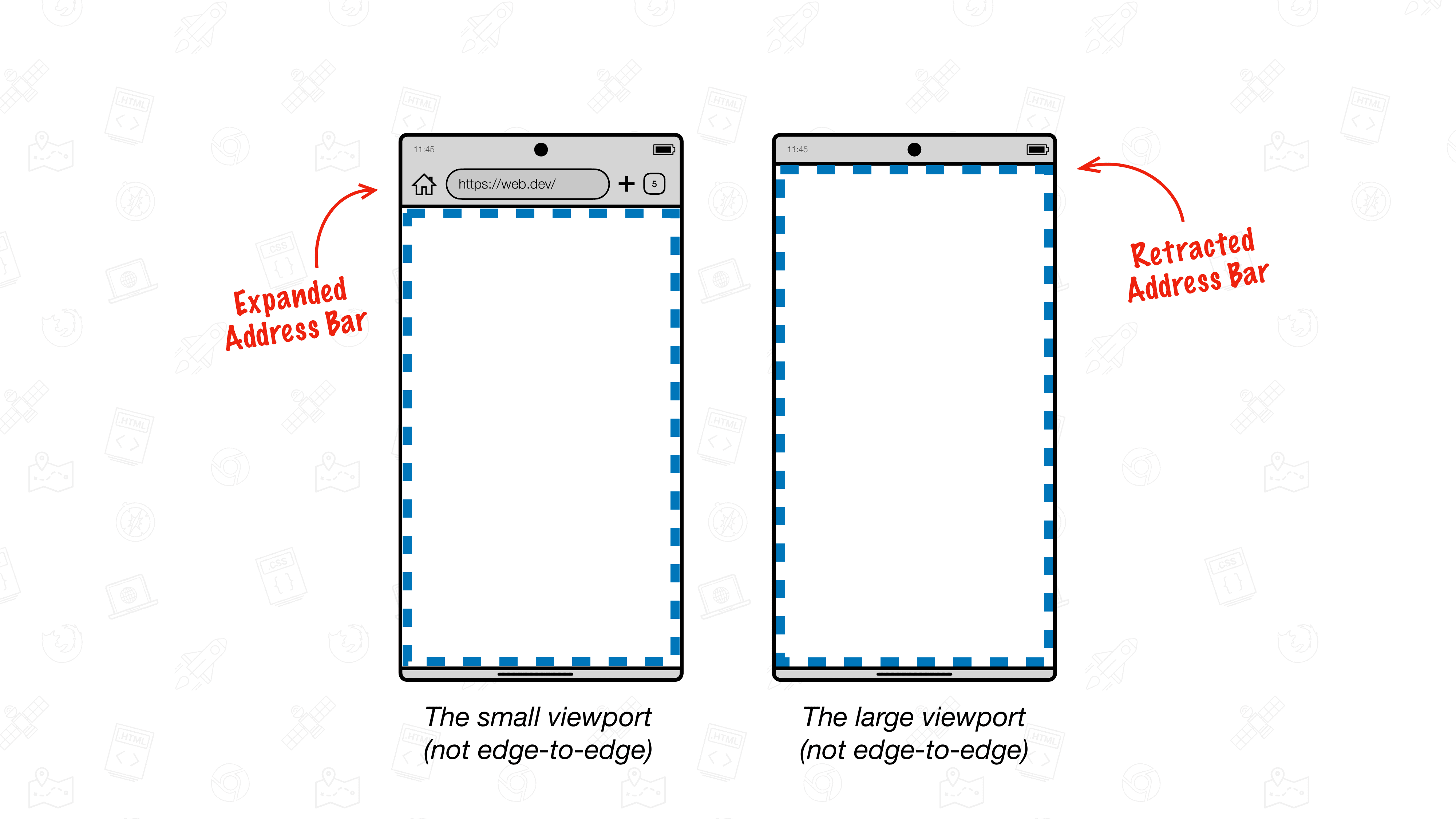
When you visit a website, that website gets presented in a rectangle known as the (layout) viewport.
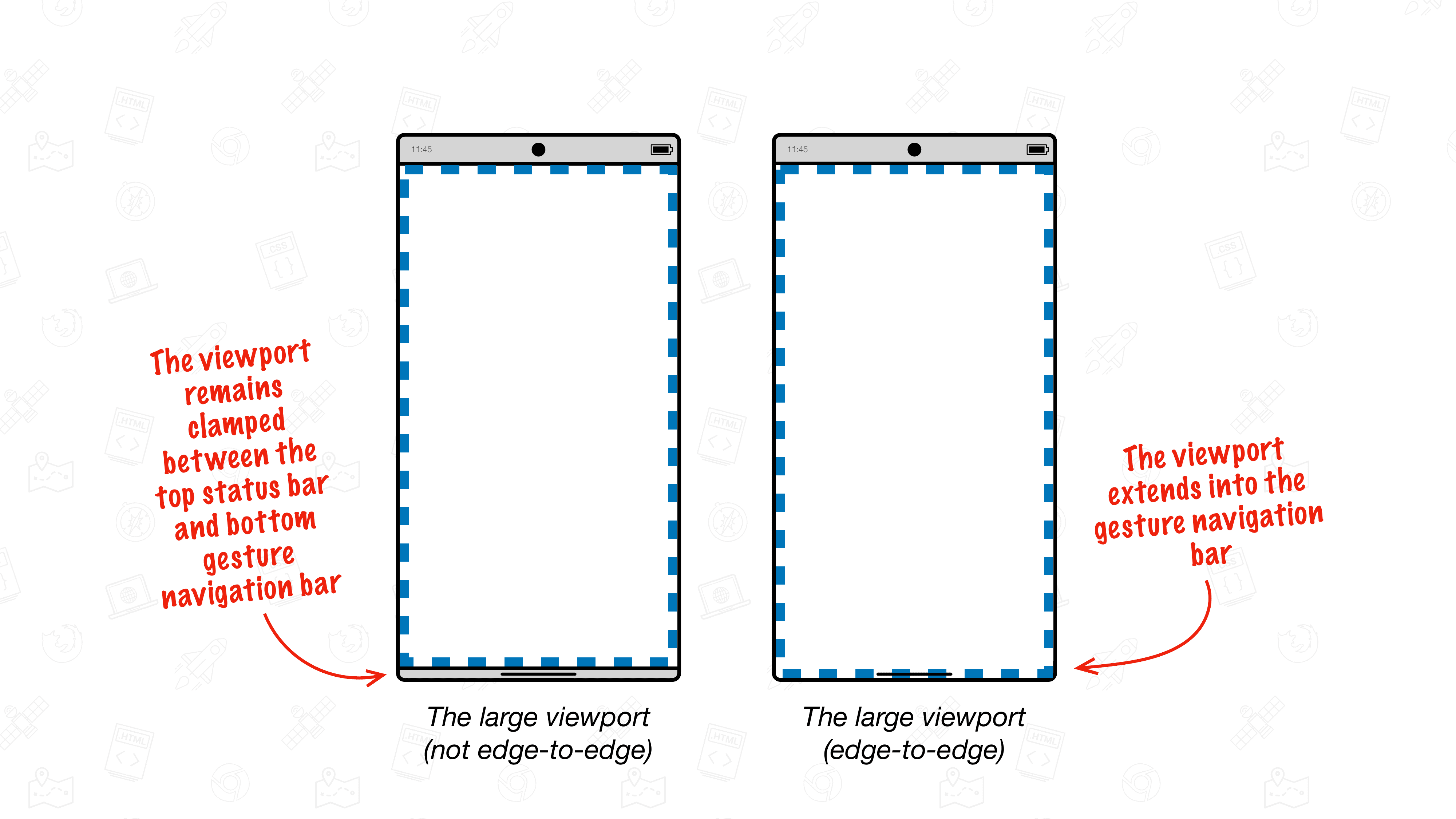
In Chrome on Android, prior to Chrome 135, that layout viewport is drawn between the top status bar and the bottom gesture navigation bar. The presence of Chrome's address bar (or lack thereof) can affect the size of the viewport, but the viewport will never expand into the top system bar or bottom gesture navigation bar.
From Chrome 135, the viewport is allowed to extend into Android's gesture navigation bar. This is the behavior described as edge-to-edge.
Chrome behavior without edge-to-edge
The following recording shows Chrome on Android without edge-to-edge support, Chrome's address bar (at the top) dynamically gets out of the way as the page is scrolled. However, the Android-native top status bar and Android-native navigation bar at the bottom remain fixed in place.
Here, the size of the layout viewport changes as Chrome's address bar retracts or expands.
Chrome behavior with edge-to-edge
From Chrome 135, Chrome can draw web content up to the bottom device edge by extending the viewport into the gesture navigation bar area.
Dynamic edge-to-edge with "the chin"
By default, Chrome edge-to-edge shows a new dynamic bottom bar known as "the chin" over the gesture navigation bar area. Just like the Chrome address bar, this chin moves out of the way as you start scrolling and affects the size of the viewport.
In the following recording of Chrome on Android with edge-to-edge support, both the Chrome address bar and chin dynamically retract as the page scrolls down. This causes the viewport to expand, allowing web content to be drawn up to the bottom edge of the device.
This chin behavior is the new default Chrome behavior from Chrome 135 onwards.
Going edge-to-edge by default with an opt-in
Websites that were built for edge-to-edge can indicate that by tweaking the viewport meta tag. When enabled, the viewport will extend up to the bottom edge by default without the chin ever being visible.
A page can indicate it supports edge-to-edge using the viewport meta tag and its viewport-fit key.
To opt-in to edge-to-edge, set viewport-fit to the value of cover.
<meta name="viewport" content="width=device-width, initial-scale=1, viewport-fit=cover" />
Learn more about the various values of viewport-fit on MDN.
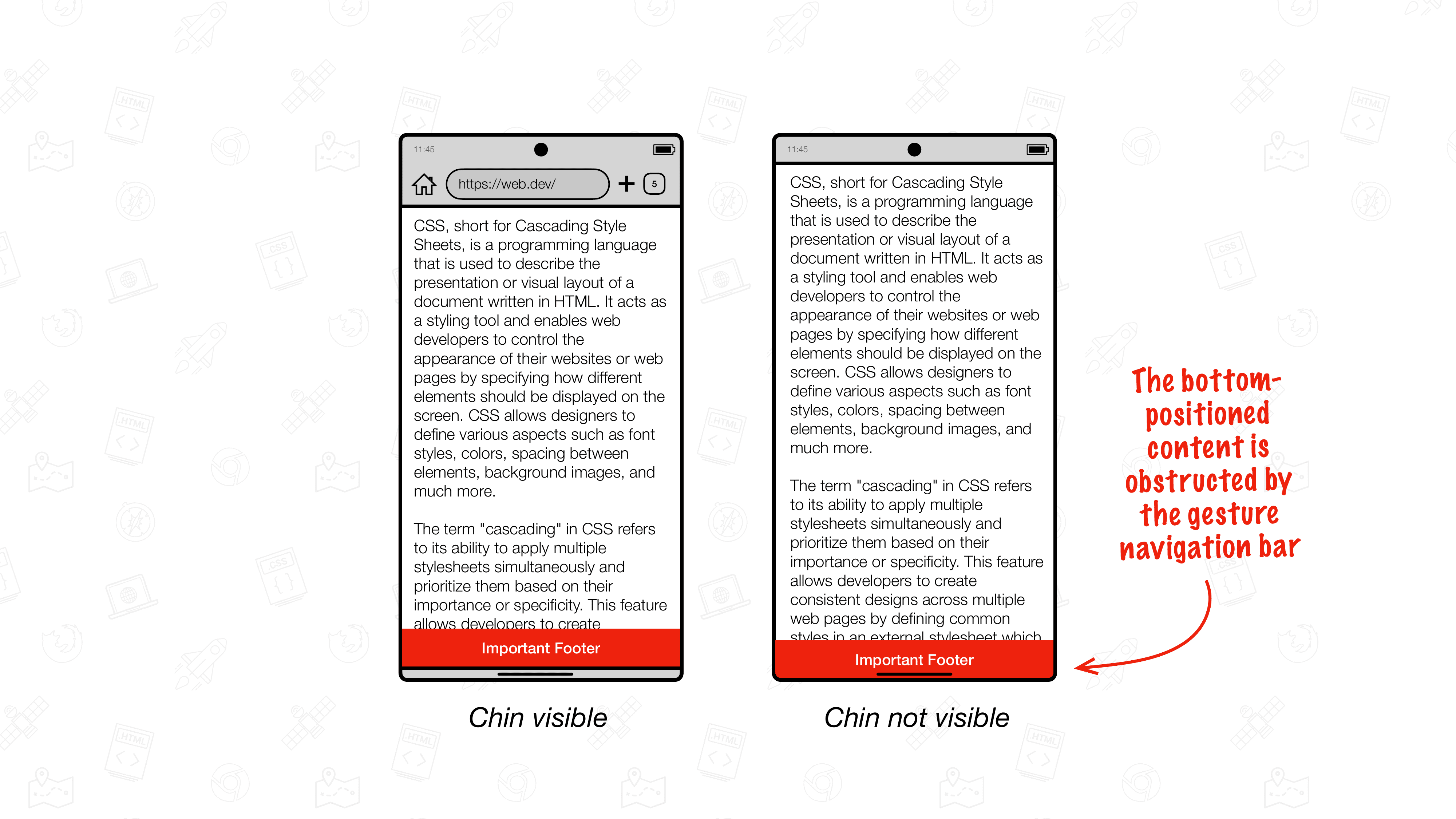
Dealing with content that might get obstructed by the gesture navigation bar
In edge-to-edge mode you should consider any content that might get obstructed by the gesture navigation bar.
In most cases, you won't need to do anything because the bottom chin moves out of the way by itself. Users can still reach all content on your website like they did before.
However, if you opt-in to going edge-to-edge by default or you have an element that is positioned at the bottom of the viewport, you may need to account for that content potentially being covered.
.stuck-to-the-bottom-of-the-viewport {
  position: fixed;
  bottom: 0;
}
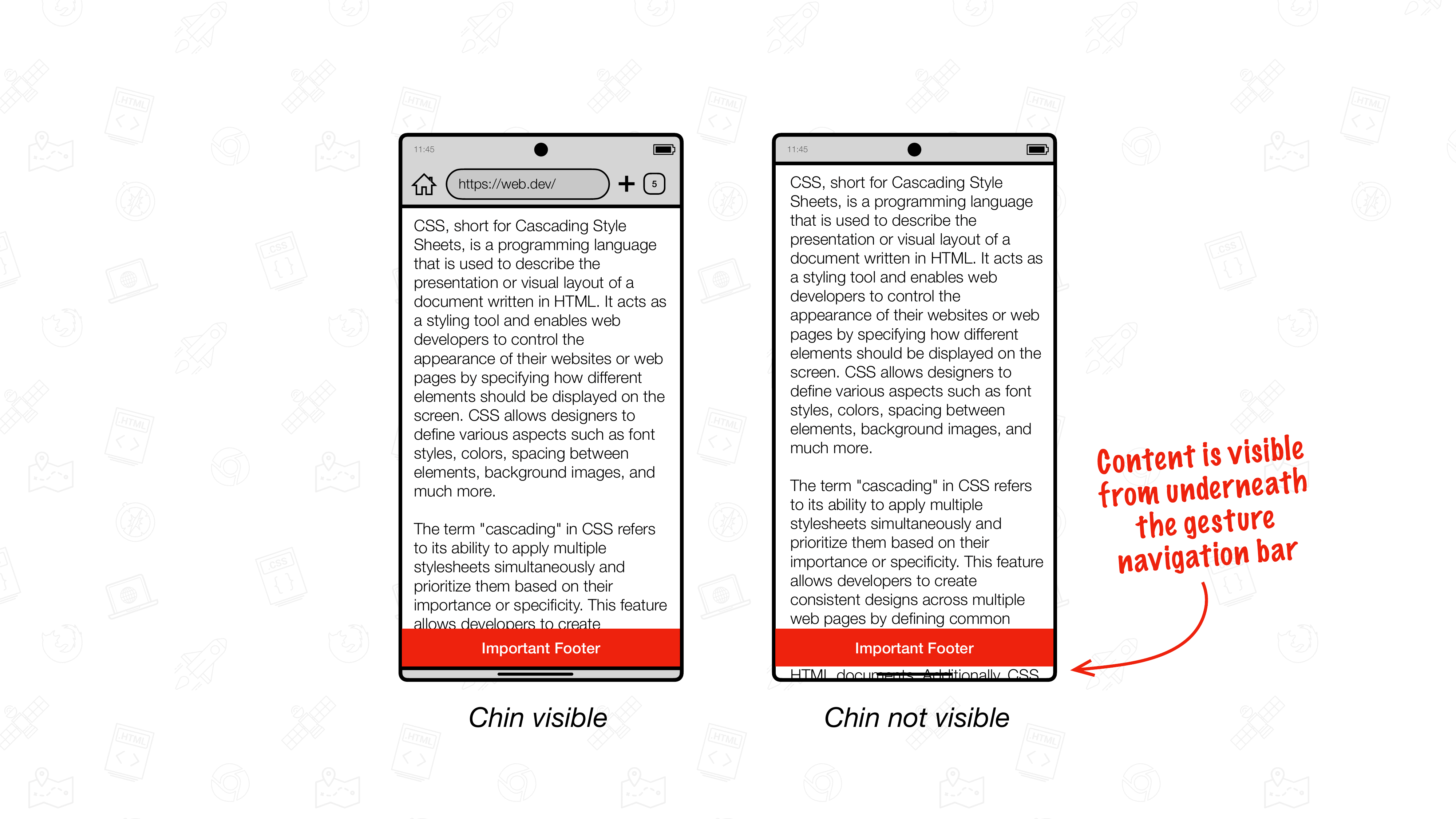
When the chin is present, the content will initially be reachable by users but will get obstructed by Android's navigation bar as the chin goes away.
To mitigate, use the safe area insets to either always position the affected elements above the Android-native bottom gesture navigation bar, or to have their background extend into that area.
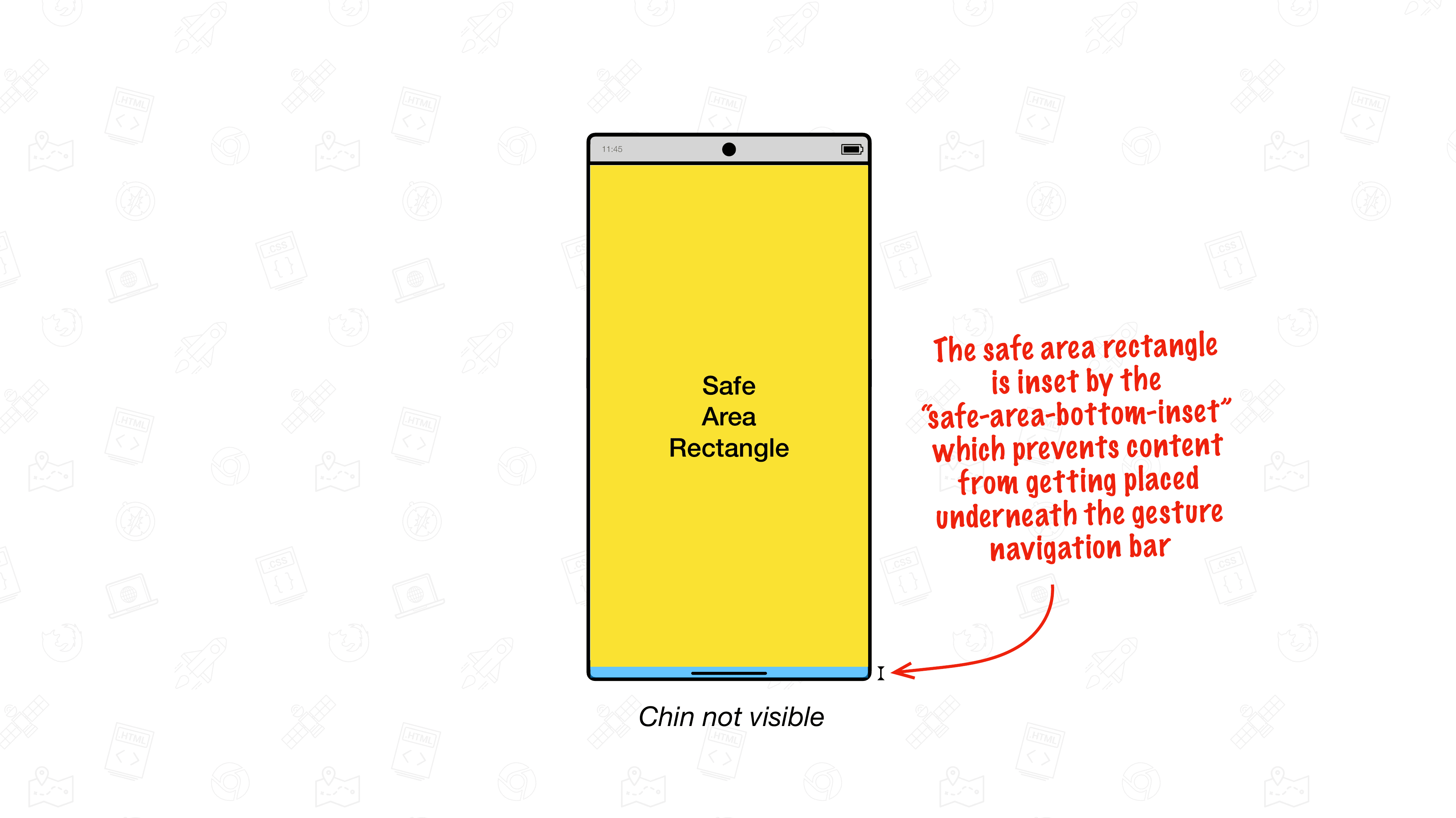
The safe area insets
The safe area insets are four environment variables that define a rectangle by its top, right, bottom, and left insets from the edge of the viewport.
Combined these four values form the safe area rectangle in which it is safe to place content so that it does not get obstructed by things such as the Android gesture navigation bar.
Using the safe area bottom inset
For elements that are positioned at the bottom of the viewport, use the safe-area-inset-bottom as the value for the bottom property to prevent it from getting positioned underneath the gesture navigation bar. The value returned by safe-area-inset-bottom gets dynamically updated as the chin moves out of the way, resulting in the bottom-positioned elements nicely staying above Android's gesture navigation bar.
.stuck-to-the-bottom-of-the-viewport {
  position: fixed;
  bottom: env(safe-area-inset-bottom, 0px);
}
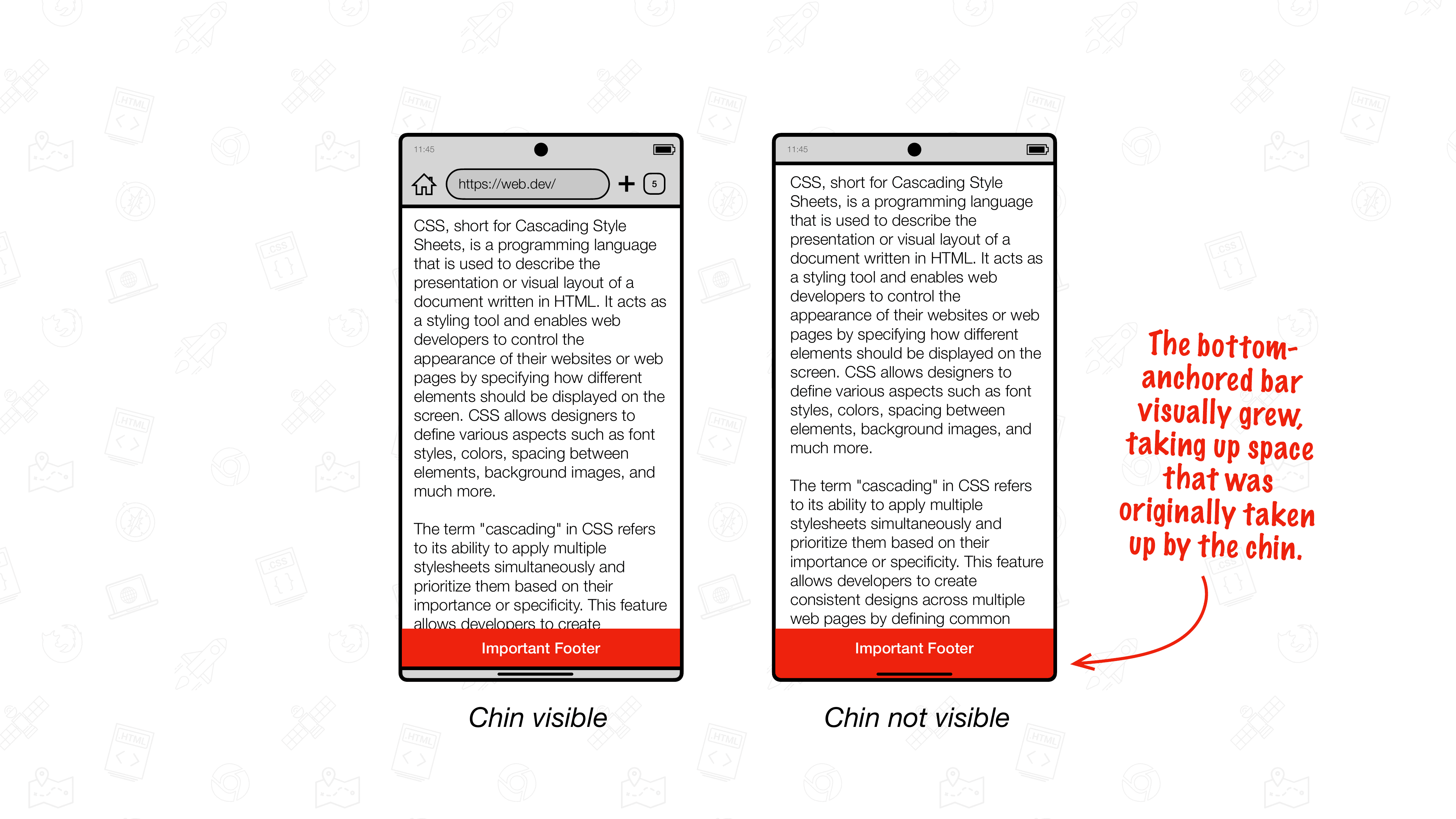
bottom property. When the chin is visible, the bar sits above Android's gesture navigation bar. When the chin goes away, the element also sits above it.As you can see in the illustrations, the outcome is not perfect yet: when the chin is moved out of the way, the remaining page content becomes visible in the gesture navigation bar area. This is because in this state the viewport extends into the gesture navigation bar area.
To prevent content from getting painted underneath bottom-anchored content, a commonly used approach is to set the padding-bottom to the safe-area-inset-bottom. That way the bottom-anchored element automatically grows as the chin hides itself. While this does work, this approach is not recommended as it results in layout thrashing while the chin moves out of the way.
Don't set the padding to a safe-area-inset value.
.stuck-to-the-bottom-of-the-viewport {
  position: fixed;
  bottom: 0;
  padding-bottom: env(safe-area-inset-bottom, 0px); /* 🛑 Don't do this, as it causes layout thrashing. */
}
Using the safe area bottom inset and the safe area bottom maximum inset
Instead, the recommended approach is to use a combination of safe-area-inset-bottom and safe-area-max-inset-bottom. Unlike the dynamic safe-area-inset-bottom which dynamically updates as the chin moves out of the way, the safe-area-max-inset-bottom represents the maximum value of the safe-area-inset-bottom.
Use this safe-area-max-inset-bottom to grow the bottom-anchored element upfront, and combine it with safe-area-inset-bottom to pull the element down so that it sits behind the chin.
Use the safe-area-max-inset-bottom in combination with the safe-area-inset-bottom
:root {
  --safe-area-max-inset-bottom: env(safe-area-max-inset-bottom, 36px);
  --bottom-bar-height: 50px;
}

.stuck-to-the-bottom-of-the-viewport {
  position: fixed;
  bottom: 0;
  height: var(--bottom-bar-height);
  padding-bottom: var(--safe-area-max-inset-bottom);
  bottom: calc(env(safe-area-inset-bottom, 0px) - var(--safe-area-max-inset-bottom));
}

body {
  padding-bottom: calc(var(--bottom-bar-height) + var(--safe-area-max-inset-bottom));
}
The visual result is the same as the padding-bottom: env(safe-area-inset-bottom, 0px); approach but it performs much better. Because only the computed value for bottom needs to change as the chin moves away, no layout thrashing occurs.
Try out edge-to-edge before Chrome 135
To try edge-to-edge before its public stable release, you need to enable quite a few Chrome feature flags through chrome://flags:
EdgeToEdgeBottomChin(optionally set it to "Enabled Debug" will color half the chin in pink to more clearly distinguish it from other UI)DrawCutOutEdgeToEdgeBottomBrowserControlsRefactor(don't set to "Enabled" but set to "Enabled Dispatch yOffset")DynamicSafeAreaInsetsDynamicSafeAreaInsetsOnScrollEdgeToEdgeWebOptInDrawKeyNativeEdgeToEdgeEdgeToEdgeSafeAreaConstraint(don't set to "Enabled" but set to "Enabled Scrollable Variation")
Make sure the following flags are not enabled:
DrawNativeEdgeToEdgeEdgeToEdgeEverywhere
Restart Chrome twice.
We want your feedback
If you have feedback on Chrome and its edge-to-edge implementation, please reach out to us by filing a Chromium bug in the "UI > Browser > Mobile > EdgeToEdge" component. We appreciate your feedback.