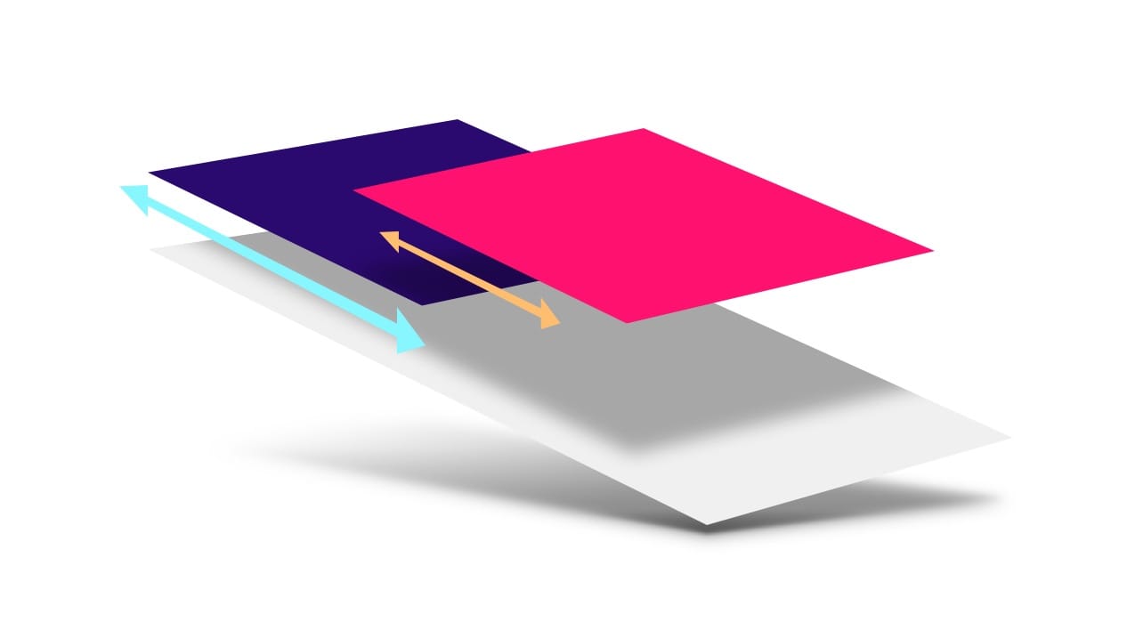
Love it or hate it, parallaxing is here to stay. When used judiciously, it can add depth and subtlety to a web app. The problem, however, is that implementing parallaxing in a performant way can be challenging. In this article, we’ll discuss a solution that is both performant and, just as importantly, works cross-browser.

TL;DR
- Don’t use scroll events or
background-positionto create parallax animations. - Use CSS 3D transforms to create a more accurate parallax effect.
- For Mobile Safari use
position: stickyto ensure that the parallax effect gets propagated.
If you want the drop-in solution, head over to the UI Element Samples GitHub repo and grab the Parallax helper JS! You can see a live demo of the parallax scroller in the GitHub repo.
Problem parallaxers
To begin with, let’s take a look at two common ways of achieving a parallax effect, and in particular, why they are unsuitable for our purposes.
Bad: using scroll events
The key requirement of parallaxing is that it should be scroll-coupled; for every single change in the page’s scroll position, the parallaxing element's position should update. While that sounds simple, an important mechanism of modern browsers is their ability to work asynchronously. This applies, in our particular case, to scroll events. In most browsers scroll events are delivered as "best-effort" and are not guaranteed to be delivered on every frame of the scroll animation!
This important piece of information tells us why we need to avoid a JavaScript-based solution that moves elements based on scroll events: JavaScript doesn’t guarantee that parallaxing will keep in step with the page’s scroll position. In older versions of Mobile Safari, scroll events were actually delivered at the end of the scroll, which made it impossible to make a JavaScript-based scroll effect. More recent versions do deliver scroll events during the animation, but, similarly to Chrome, on a "best-effort" basis. If the main thread is busy with any other work, scroll events will not get delivered immediately, meaning the parallax effect will be lost.
Bad: updating background-position
Another situation we’d like to avoid is painting on every frame. Many solutions
attempt to change background-position to provide the parallax look, which
causes the browser to repaint the affected parts of the page on scroll, and that
can be costly enough to significantly jank the animation.
If we want to deliver on the promise of parallax motion, we want something that can be applied as an accelerated property (which today means sticking to transforms and opacity), and which doesn’t rely on scroll events.
CSS in 3D
Both Scott Kellum and Keith Clark have done significant work in the area of using CSS 3D to achieve parallax motion, and the technique they use is effectively this:
- Set up a containing element to scroll with
overflow-y: scroll(and probablyoverflow-x: hidden). - To that same element apply a
perspectivevalue, and aperspective-originset totop left, or0 0. - To the children of that element apply a translation in Z, and scale them back up to provide parallax motion without affecting their size on screen.
The CSS for this approach looks like so:
.container {
  width: 100%;
  height: 100%;
  overflow-x: hidden;
  overflow-y: scroll;
  perspective: 1px;
  perspective-origin: 0 0;
}

.parallax-child {
  transform-origin: 0 0;
  transform: translateZ(-2px) scale(3);
}
Which assumes a snippet of HTML like this:
<div class="container">
    <div class="parallax-child"></div>
</div>
Adjusting scale for perspective
Pushing the child element back will cause it to get smaller proportional to the perspective value. You can calculate how much it will need to be scaled up with this equation: (perspective - distance) / perspective. Since we most likely want the parallaxing element to parallax but appear at the size we authored it, it would need to be scaled up in this way, rather than being left as is.
In the case of the above code, perspective is 1px, and the
parallax-child's Z distance is -2px. This means that the element will need
to be scaled up by 3x, which you can see is the value plugged into the code:
scale(3).
For any content that doesn’t have a translateZ value applied, you can
substitute a value of zero. This means the scale is (perspective - 0) /
perspective, which nets out at a value of 1, which means that it’s been scaled
neither up or down. Quite handy, really.
How this approach works
It’s important to be clear why this works, since we’re going to use that
knowledge shortly. Scrolling is effectively a transform, which is why it can be
accelerated; it mostly involves shifting layers around with the GPU. In a
typical scroll, which is one without any notion of perspective, scrolling
happens in a 1:1 manner when comparing the scrolling element and its children.
If you scroll an element down by 300px, then its children are transformed up
by the same amount: 300px.
However, applying a perspective value to the scrolling element messes around
with this process; it changes the matrices that underpin the scroll transform.
Now a scroll of 300px may only move the children by 150px, depending on the
perspective and translateZ values you chose. If an element has a
translateZ value of 0, it will be scrolled at 1:1 (as it used to), but a child
pushed in Z away from the perspective origin will be scrolled at a different
rate! Net result: parallax motion. And, very importantly, this is handled as
part of the browser’s internal scroll machinery automatically, meaning there’s
no need to listen to scroll events or change background-position.
A fly in the ointment: Mobile Safari
There are caveats to every effect, and one important one for transforms is about the preservation of 3D effects to child elements. If there are elements in the hierarchy between the element with a perspective and its parallaxing children, the 3D perspective is "flattened", meaning the effect is lost.
<div class="container">
    <div class="parallax-container">
    <div class="parallax-child"></div>
    </div>
</div>
In the above HTML, the .parallax-container is new, and it will effectively
flatten the perspective value and we lose the parallax effect. The solution,
in most cases, is fairly straightforward: you add transform-style: preserve-3d
to the element, causing it to propagate any 3D effects (like our perspective
value) that have been applied further up the tree.
.parallax-container {
  transform-style: preserve-3d;
}
In the case of Mobile Safari, however, things are a little more convoluted.
Applying overflow-y: scroll to the container element technically works, but at
the cost of being able to fling the scrolling element. The solution is to add
-webkit-overflow-scrolling: touch, but it will also flatten the perspective
and we won’t get any parallaxing.
From a progressive enhancement point-of-view, this probably isn’t too much of an issue. If we can’t parallax in every situation, our app will still work, but it would be nice to figure out a workaround.
position: sticky to the rescue!
There is, in fact, some help in the form of position: sticky, which exists to
allow elements to "stick" to the top of the viewport or a given parent element
during scroll. The spec, like most of them, is fairly hefty, but it contains a
helpful little gem within:
This may not appear to mean a great deal at first glance, but a key point in that sentence is when it refers to how, exactly, the stickiness of an element is calculated: "the offset is computed with reference to the nearest ancestor with a scrolling box". In other words, the distance to move the sticky element (in order for it to appear attached to another element or the viewport) is calculated before any other transforms are applied, not after. This means that, very much like the scrolling example earlier, if the offset was calculated at 300px, there’s a new opportunity to use perspectives (or any other transform) to manipulate that 300px offset value before it’s applied to any sticky elements.
By applying position: -webkit-sticky to the parallaxing element, we can
effectively "reverse" the flattening effect of -webkit-overflow-scrolling:
touch. This ensures that the parallaxing element references the nearest
ancestor with a scrolling box, which in this case is .container. Then,
similarly to before, the .parallax-container applies a perspective value,
which changes the calculated scroll offset and creates a parallax effect.
<div class="container">
    <div class="parallax-container">
    <div class="parallax-child"></div>
    </div>
</div>
.container {
  overflow-y: scroll;
  -webkit-overflow-scrolling: touch;
}

.parallax-container {
  perspective: 1px;
}

.parallax-child {
  position: -webkit-sticky;
  top: 0px;
  transform: translate(-2px) scale(3);
}
This restores the parallax effect for Mobile Safari, which is excellent news all round!
Sticky positioning caveats
There is a difference here, however: position: sticky does alter the
parallax mechanics. Sticky positioning tries to, well, stick the element to the
scrolling container, whereas a non-sticky version doesn’t. This means that the
parallax with sticky ends up being the inverse of the one without:
- With
position: sticky, the nearer the element is to z=0 the less it moves. - Without
position: sticky, the nearer the element is to z=0 the more it moves.
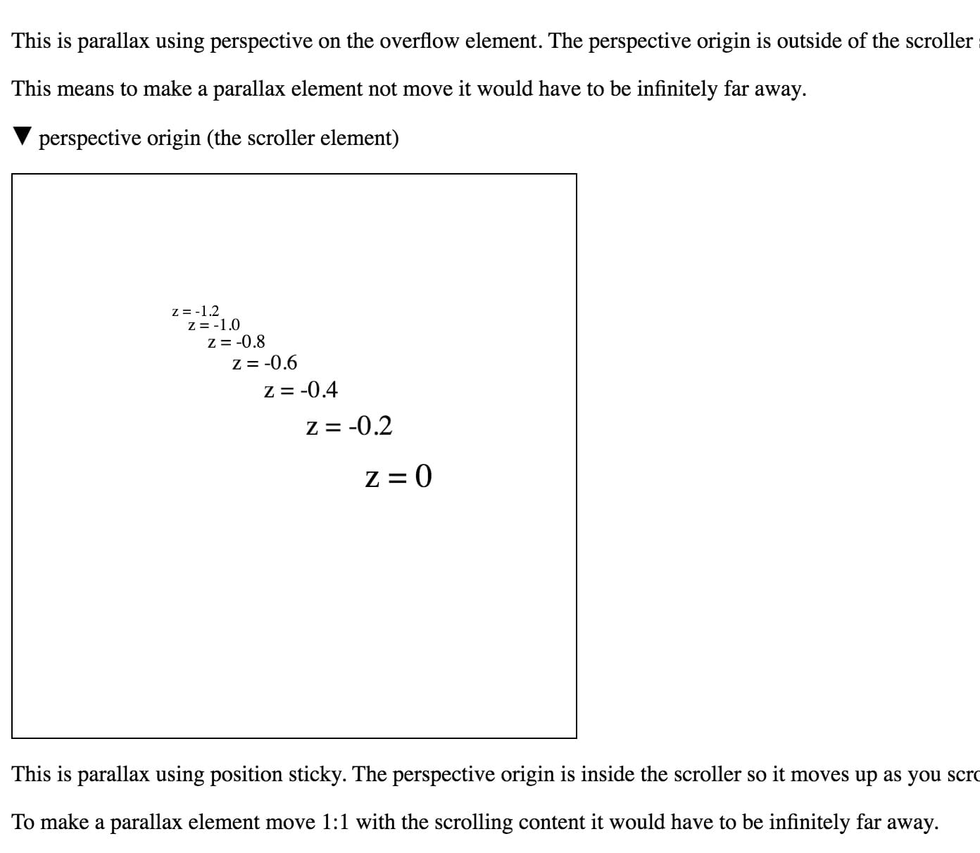
If that all seems a bit abstract, take a look at this demo by Robert Flack, which demonstrates how elements behave differently with and without sticky positioning. To see the difference, you need Chrome Canary (which is version 56 at the time of writing) or Safari.

A demo by Robert Flack showing how
position: sticky affects parallax scrolling.
Assorted bugs and workarounds
As with anything, though, there are still lumps and bumps that need to be smoothed over:
- Sticky support is inconsistent. Support is still being implemented in
Chrome, Edge lacks support entirely, and Firefox has painting bugs when sticky is combined with perspective transforms. In such
cases, it’s worth adding a little code to only add
position: sticky(the-webkit-prefixed version) when it’s needed, which is for Mobile Safari only. - The effect doesn’t "just work" in Edge. Edge tries to handle scrolling at the OS level, which is generally a good thing, but in this case it prevents it from detecting the perspective changes during scroll. To fix this, you can add a fixed position element, as this seems to switch Edge over to a non-OS scrolling method, and ensures that it accounts for perspective changes.
- "The page’s content just got huge!" Many browsers account for the scale
when deciding how big the page’s content is, but sadly Chrome and Safari
don’t account for perspective. So
if there’s - say - a scale of 3x applied to an element, you may
well see scroll bars and the like, even if the element is at 1x after the
perspectivehas been applied. It is possible to work around this issue by scaling elements from the bottom right corner (withtransform-origin: bottom right), which works because it will cause oversized elements to grow into the "negative region" (typically the top left) of the scrollable area; scrollable regions never let you see or scroll to content in the negative region.
Conclusion
Parallaxing is a fun effect when used thoughtfully. As you can see, it’s possible to implement it in a way that is performant, scroll-coupled, and cross-browser. Since it requires a little bit of mathematical wriggling, and a small amount of boilerplate to get the desired effect, we have wrapped up a small helper library and sample, which you can find in our UI Element Samples GitHub repo.
Have a play, and let us know how you get on.

