


Chrome 正在试用两个 API,即 Device Posture API 和 Viewport Segments Enumeration API,这两个 API 从 Chrome 125 开始可作为源试用。这些 API 统称为可折叠设备 API,旨在帮助开发者以可折叠设备为目标平台。本文介绍了这些 API,并提供了有关如何开始测试这些 API 的信息。
主要有两种不同的物理外形规格:具有单个柔性屏幕(无缝)的设备,以及具有两个屏幕(有缝,也称为双屏设备)的设备。
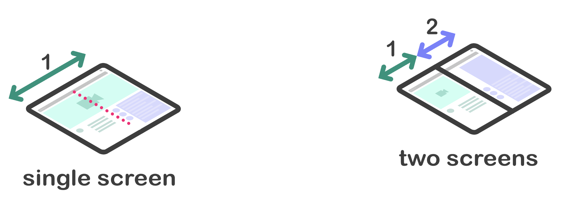
这些设备为开发者带来了挑战和机遇。它们提供了其他观看内容的方式。例如,用户可以像拿着一本书一样拿着无缝设备,然后改为像使用平板电脑一样使用它。双屏设备的两个屏幕之间有物理连接,可能需要考虑到这一点。
这些新 API 为开发者提供了多种方式,可为这些设备提供更好的用户体验。每个 API 都通过 CSS 和 JavaScript 以两种方式公开所需的 Web 平台基元。
Device Posture API
可折叠设备具有可更改其_折叠状态_(即设备的物理状态)的功能。它们可以更改外形规格,让内容创作者能够提供不同的用户体验,而这些新 API 可确保 Web 内容能够对各种折叠状态做出响应。
设备可以处于两种设备折叠状态:
folded:笔记本电脑或图书阅读姿势。
continuous:平板、平板电脑,甚至无缝曲面显示屏。
CSS
Device Posture API 规范定义了一种新的 CSS 媒体功能 - device-posture。此媒体功能会解析为一组固定的折叠状态。这些折叠状态由一系列预定义值组成,每个值都包含设备的物理状态。
device-posture 特征的值与之前对可能的姿势的说明相符:
foldedcontinuous
如果市场上有新设备推出,我们日后可能会添加新的折叠状态。
示例:
/* Using the device in a 'book' posture. */
@media (device-posture: folded) { ... }

/* Using the device in a 'flat' posture, or any typical device like a laptop or
desktop device. */
@media (device-posture: continuous) { ... }
JavaScript
如需查询设备的折叠状态,可以使用新的 DevicePosture 对象。
const { type } = navigator.devicePosture;
console.log(`The current device is of type ${type}.`);
如需响应设备折叠状态变化(例如,用户完全打开设备,因此从 folded 切换到 continuous),请订阅 change 事件。
navigator.devicePosture.addEventListener('change', (e) => {
  console.log(`The device posture changed to type ${e.type}`);
});
Viewport Segments API
视口细分是 CSS 环境变量,用于定义视口中逻辑上分隔区域的位置和尺寸。当视口被一个或多个硬件功能(例如折叠处或单独显示屏之间的合页)分隔时,系统会创建视口片段。细分是指视口中可由作者视为逻辑上不同的区域。
CSS
逻辑划分数量通过 CSS 媒体查询第 5 级规范中定义的两个新媒体功能(vertical-viewport-segments 和 horizontal-viewport-segments)公开。它们会解析为视口被分割成的段数。
此外,还添加了新的环境变量,用于查询每个逻辑划分的维度。这些变量包括:
env(viewport-segment-width x y)env(viewport-segment-height x y)env(viewport-segment-top x y)env(viewport-segment-left x y)env(viewport-segment-bottom x y)env(viewport-segment-right x y)
每个变量都有两个维度,分别表示由分隔细分段的硬件特征创建的二维网格中的 x 和 y 位置。
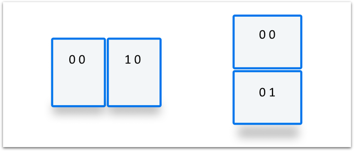
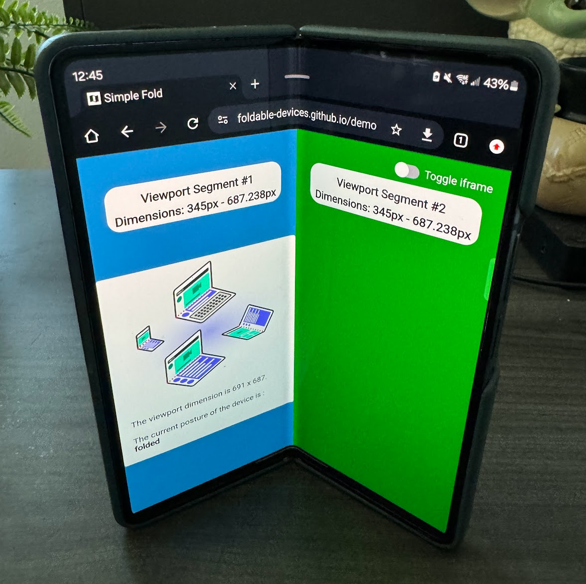
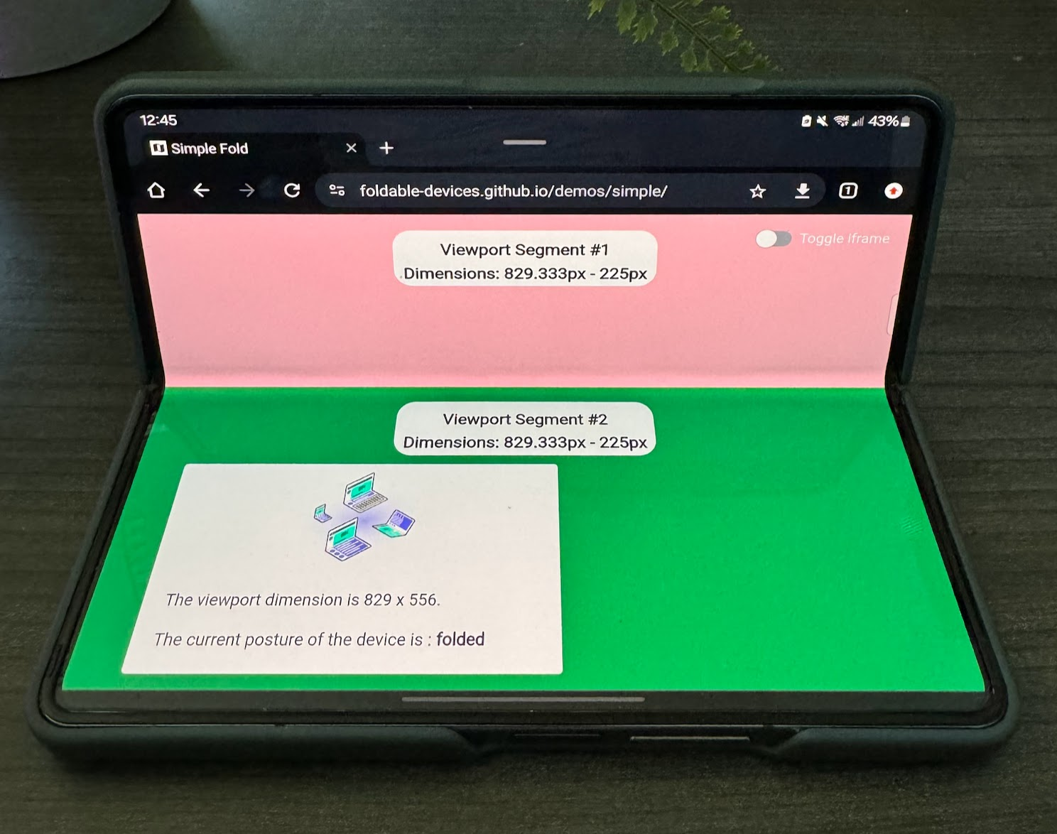
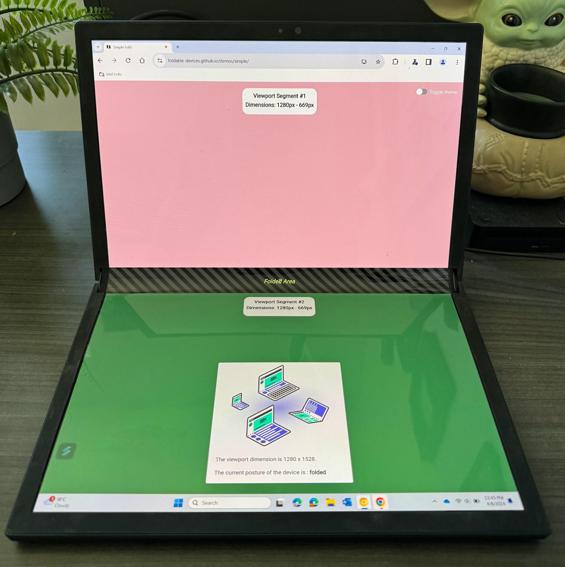
以下代码段是一个简化示例,展示了如何创建分屏界面,其中折叠边的两侧各有一个内容部分(col1 和 col2)。
<style>
  /* Segments are laid out horizontally. */
  @media (horizontal-viewport-segments: 2) {
    #segment-css-container {
      flex-direction: row;
    }

    #col1 {
      display: flex;
      flex: 0 0 env(viewport-segment-right 0 0);
      background-color: steelblue;
    }

    #fold {
      width: calc(env(viewport-segment-left 1 0) - env(viewport-segment-right 0 0));
      background-color: black;
      height: 100%;
    }

    #col2 {
      display: flex;
      background-color: green;
    }
  }

  /* Segments are laid out vertically. */
  @media (vertical-viewport-segments: 2) {
    #segment-css-container {
      flex-direction: column;
    }

    #col1 {
      display: flex;
      flex: 0 0 env(viewport-segment-bottom 0 0);
      background-color: pink;
    }

    #fold {
      width: 100%;
      height: calc(env(viewport-segment-top 0 1) - env(viewport-segment-bottom 0 0));
      background-color: black;
    }

    #col2 {
      display: flex;
     background-color: seagreen;
    }
  }
</style>

<div id="segment-css-container">
   <div id="col1"></div>
   <div id="fold"></div>
   <div id="col2"></div>
 </div>
以下照片展示了该体验在实体设备上的显示效果。
JavaScript
如需获取视口细分数,请查看 visualViewport 中的 segments 条目。
const segments = window.visualViewport.segments;
console.log('The viewport has the following segments:', segments);
segments 数组中的每个条目都代表视口的每个逻辑细分,其中包含一个用于描述坐标和大小的 DOMArray。segments 字段是查询时给定状态的快照,为了接收更新后的值,您需要监听屏幕折叠状态变化或大小调整事件,并重新查询 segments 属性。
试用可折叠设备 API
从 Chrome 125 到 Chrome 128,可在源试用中使用可折叠设备 API。如需了解与源代码试用相关的背景信息,请参阅源代码试用使用入门。
对于本地测试,您可以使用 chrome://flags/#enable-experimental-web-platform-features 中的“Experimental Web Platform features”标志启用可折叠设备 API。您也可以使用 --enable-experimental-web-platform-features 从命令行运行 Chrome 来启用此功能。
演示
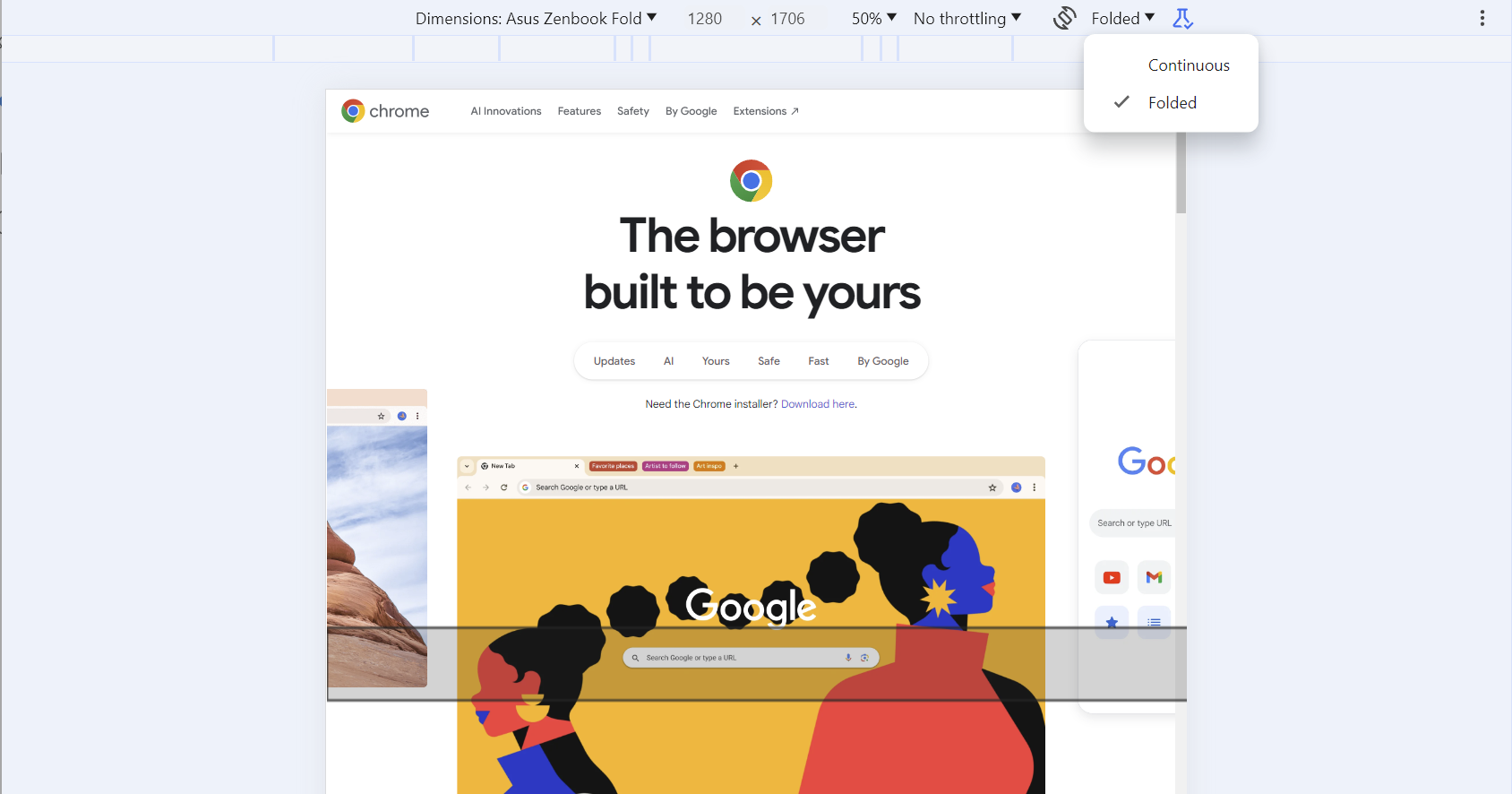
如需查看演示,请参阅演示仓库。如果您没有用于测试的实体设备,可以在 Chrome 开发者工具中选择 Galaxy Z Fold 5 或 Asus Zenbook Fold 模拟设备,并在展开和折叠模式之间切换。您还可以直观地查看合页(如果适用)。
相关链接
- Device Posture API
- Viewport Segments API